
How to use a kanban board: a complete guide with a real example
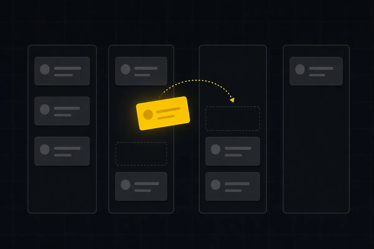
You have a pile of work and no idea what is actually moving. Three things are half-done, two are stuck waiting on someone else, and the one that's on fire is buried in a spreadsheet row nobody has opened since Tuesday. Learning how to use a kanban board fixes exactly that, and it takes about five minutes to feel the difference. This guide walks the whole thing on a real Utter project: reading a board you've never seen, moving work across it, then bending the columns around how your team actually operates.
Here is what you'll walk away able to do:
- Read a board at a glance, so every column, count pill, and card chip is telling you something before you touch anything.
- Move work by dragging cards between columns, or drive the whole board from the keyboard, and understand what the status change actually does underneath.
- Create tasks three different ways and land each one in the exact column you want.
- Shape the board to your process: add, rename, recolour, reorder, and delete columns, and set real WIP limits and workflow rules in project settings.
- Cut a busy board down to what matters with filters, saved Views, and swimlanes, and know which board settings persist and which don't.
What a kanban board actually is (and what the columns mean)
A kanban board is a set of columns you drag cards across, left to right, as work moves from "not started" to "done." That's the whole idea. Each card is a piece of work. Each column is a stage. The position of a card is the honest answer to "where is this?"
So how to use a kanban board comes down to three moves: read the columns, move the cards, then shape the columns to fit how your team works. The rest of this guide is those three things, in that order, on a real board.
Here's the part that's specific to Utter, and it's worth getting straight up front because it changes how you think about everything else. The columns are not a fixed set the app hands you. They are your project's custom statuses, stored per project, rendered left to right in the order you rank them.
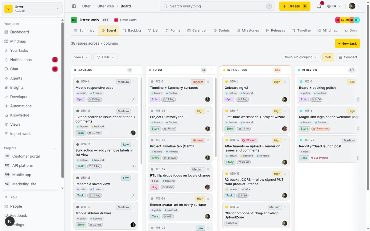
The demo WEB project you'll see throughout this guide ships with 7 default columns: Backlog, To Do, In Progress, In Review, Done, plus the Failed and Cancelled category columns. You open the board at /w/[workspace]/p/[project]/board.
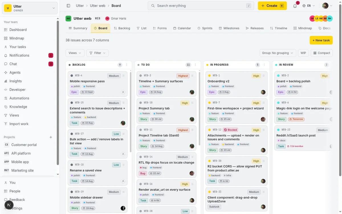
Look at the header first. It gives you a live read on the project, something like "42 issues across 7 columns." That count is open issues, and it moves as work opens and closes. Each column carries its own count pill in its header too, so you can see at a glance that In Progress is holding nine cards while In Review is holding two.
When those numbers get lopsided, that's information. Nine in progress and two in review usually means work is starting faster than it's finishing, which is the single most common way teams quietly drown.
We're in project WEB for the rest of this guide. There's a ticket called "Timeline + Summary tab" that we'll follow around the board: creating it, moving it, filtering for it, editing it in place. It's a normal task, the kind that sits in your backlog until someone picks it up.
How to read a card before you touch anything
Before you drag a single thing, learn to read a card. The card face is dense on purpose. Every element is there so you can make a decision without opening the issue, and once you can read it fluently, the board stops being a wall of rectangles and starts being a status report.
Working across the card, here is what each element is telling you and why you'd care:
- Status dot. A small coloured dot that matches the column's colour. Redundant when you're staring at the board (the card is already in the column), useful the moment you filter or group and want a fast visual anchor.
- Issue key. Something like WEB-12. Stable across renames, the thing you say out loud in standup. It links to the issue.
- Blocked badge. When the issue is blocked, a "Blocked" badge appears, and its tooltip carries the open-blocker count ("Blocked by 2 open issues"). This is the one to scan for first. A blocked card sitting in In Progress is not actually progressing, no matter what column it's parked in.
- Priority badge. How much this should hurt if it slips.
- Title. The human name of the work. Clicking it opens the issue. (More on why that "clicking" matters in a second.)
- Labels. Up to 3 shown, with a "+N" overflow chip when there are more. Labels are how you slice the board later with filters.
- Type badge. Epic, story, task, bug, subtask. A column full of bugs reads very differently from a column full of stories.
- Sprint chip. Which sprint this belongs to, when the project runs sprints.
- Due-date chip, tinted by urgency. Pink when it's overdue, orange when it's due soon. This is the quiet hero of the card face. A pink due chip on a card still sitting in Backlog is a problem you can see from across the room without opening anything. That's the whole point of a good card.
- Assignee avatar. Who owns it. When two or more people are assigned, you get an overlapping avatar stack instead of a single face.
One practical note for big projects. The board doesn't load ten thousand cards into your browser. It pages them, showing "{shown} of {total}" at the foot of a column with a "Load more (N)" button, and at real scale that total is a capped count that reads like "1000+" rather than an exact figure. So if a column says "50 of 1000+", you're looking at the first page, not the whole thing. Load more when you need to dig deeper.
Move a task between columns (the whole point)
Now the move that gives kanban its name. Drag a card into another column and its status changes. Drag a card up or down inside a column and you re-rank it, which is how you say "do this one before that one" without changing its status. This is the shared idea behind every board tool, Trello included. Utter's version just does more underneath the drop.
The whole card is the drag surface, which sounds like it would fight with all those clickable chips and the title link. It doesn't, because of one deliberate detail: the pointer has to travel 6 pixels before a drag starts. Under that threshold, a click is a click, so tapping the title still opens the issue and clicking a chip still edits it. Past it, you're dragging. You'll stop noticing this within a minute of using it.
Moves are optimistic. The card jumps to where you dropped it immediately, before the server has confirmed anything, because waiting on a round-trip for every drag would feel like moving through syrup. Underneath, the drop persists two things: which column the card now lives in (its status) and where it sits in that column (its rank).
sequenceDiagram
  participant You
  participant Board
  participant Server
  You->>Board: drop card in a new column
  Board->>Board: card moves instantly
  Board->>Server: persist status and rank
  alt write succeeds
    Server-->>Board: confirmed, nothing else happens
  else write fails
    Server-->>Board: error with a reason
    Board->>Board: card snaps back, toast explains why
  end
If the write fails, the card snaps back to where it was and a toast tells you why. The message is specific about the reason. A permission problem reads differently from a transient network hiccup, which reads differently from a workflow rule blocking the move.
While you drag, the board helps you aim. A dashed placeholder slot marks where the card came from and where it will land, so you can see the gap it'll drop into. Drag over an empty column and it shows a "Release to drop" hint so you know the target is live.
You don't need the mouse at all. The keyboard path is complete:
- Focus a card (tab to it).
- Space or Enter to pick it up.
- Arrow keys to move it between columns and within a column.
- Space or Enter again to drop it.
- Escape to cancel and put it back.
Every step is announced through an aria-live region, so a screen-reader user hears "picked up," "moved to In Progress," "dropped." This is a genuinely good keyboard experience, not a checkbox someone ticked.
Now the honest limit, because you'll hit it and I'd rather you hit it knowing. Utter supports workflow transition rules: a project can be set so that, say, a card in Backlog can only move to To Do, not straight to Done. Those rules are enforced on the server on every status write, and the status pickers pre-filter to only allowed targets.
But the board does not grey out or disable a column to preview a blocked move before you attempt it. So you can pick up a card, drag it to a column the workflow forbids, drop it, and only then find out: the card reverts and a toast reads "Blocked by workflow: this move is not allowed." Board grey-out to show blocked targets ahead of time is deferred. It's on the list. It isn't here yet.
One permission note. Dragging needs issue edit permission (edit your own or edit any). Viewers get a read-only board: no drag handlers, no in-place editing, plain badges instead of editable chips. That's by design. A viewer is there to watch, not to move your work around.
Create a task and land it in the right column
There are three ways to create a task, and the difference between them is mostly about where the card is born. Picking the right one saves you a drag every time.
1. The header "+ New task" button. Top of the board. It opens the New task dialog already scoped to the current project, so you're not fishing WEB out of a list every time. This is your default when you're not thinking about which column the task should start in. It lands in the project's default starting status.
2. Quick-add inside an empty column. This is the one people miss, and it's the best of the three when it applies. An empty column shows a "+ New task" placeholder button right in the column body. Click it and the New task dialog opens with that column's exact status pre-selected. The card is born in the right place. No create-then-drag, no "oops, wrong column."
Two caveats from how it's built: the placeholder only shows to people who can create issues, and it is not offered for a Cancelled-category column (creating work directly into "Cancelled" makes no sense, so the affordance isn't there).
3. Press "c" from anywhere. With focus outside any text field and no modifier key held (no Cmd, Ctrl, or Alt), tapping "c" opens the New task dialog. It's the global quick-create shortcut, and it's listed in the keyboard shortcuts help, so you don't have to memorise it blind. This is the fastest path once it's in your fingers. You're reading a card, an idea hits, "c", type, done.
Which one to reach for:
flowchart TD
  A[Need a new task] --> B{Is the target column empty?}
  B -->|yes| C[Quick add inside that column]
  B -->|no| D{Hands on the keyboard?}
  D -->|yes| E[Press c]
  D -->|no| F[Header New task button]
  C --> G[Card born in the right column]
  E --> H[Card lands in the default column]
  F --> H
  H --> I[Drag it where it belongs]
Concrete example. Say the "Timeline + Summary tab" work is already underway and you want its card to start life in In Progress rather than Backlog. If In Progress happens to be empty, use its in-column "+ New task" placeholder: the dialog opens with In Progress pre-selected, you type the title, and the card appears exactly where it belongs. Compare that to creating from the header (card lands in the default column) and then dragging it two columns over. Same result, more steps, one more chance to fumble the drop. When the target column is empty, quick-add wins.
Customize your columns: add, rename, recolour, reorder, delete
Here is where a board stops being generic and starts being yours. First, the gate, because it matters and it's easy to get wrong when you're explaining this to teammates: all column management needs the project edit-settings permission. That means admins and owners, the people who can edit project settings, not any member and definitely not a viewer.
A regular member won't even see the "+ Add status" lane or the management controls. So if a teammate says "I don't have that button," this is almost always why.
Adding a column. At the right end of the board there's a trailing "+ Add status" lane. Open it and you set three things:
- A Status name (this is the column header text).
- A Category, chosen from seven: Backlog, To do, In progress, In review, Done, Failed, Cancelled.
- A colour, either one of 8 preset swatches or a custom hex via the colour picker. The stored value is a 6-digit hex (#RRGGBB), so the presets are real colours, not theme tokens.
The Category is the part to slow down on. It is the semantic backbone of the whole system. The picker even spells it out: "Category controls open/done behaviour in reports." Your column name is cosmetic. Its category is what tells Utter whether a card in it counts as open or done, what feeds into reports, and what the public API reports as the status.
| Category | How reports and filters treat it |
|---|---|
| Backlog, To do, In progress, In review | Open work |
| Done, Failed, Cancelled | Resolved. The issue gets a resolved timestamp when it lands here |
So if you add a "Blocked" column, think about what it means: it's work that's started but stuck, which maps to the In progress category, not Done. Name it whatever you like. Categorise it honestly.
Managing an existing column. Every column header has a kebab menu (labelled Manage). Open it and you can rename inline, recolour (swatch or custom), recategorise via the Category select, Move left, Move right, or Delete status. The whole per-column surface, one place.
Reordering. Two ways, same result. Drag the column header left or right, or use the kebab's Move left / Move right buttons. Both call the same underlying reorder action. The header drag is optimistic, so the column follows your pointer and settles when the server confirms. Drag when you're rearranging several columns at once. Use the Move buttons when you just want to nudge one over by a slot.
Deleting. This one has teeth, so read before you click. Deleting a column pops a confirm dialog. If the column holds cards, deleting it soft-deletes those issues, and they're recoverable for 30 days. The confirm dialog warns you plainly ("Issues in this column will be soft-deleted. They are recoverable for 30 days."), and after you confirm, the toast reports the damage: "Column deleted. {count} issues archived."
The picker also refuses to delete the project's last column, because a board with zero columns isn't a board. So the classic mistake, deleting a column you assumed was empty and quietly archiving eight tickets, is one the app tries to warn you out of. Read the count in that toast.
One honesty note so you don't build a wrong mental model: there are seven categories, but the default board does not ship a column for every one. Failed, in particular, is not one of the columns on the default board and isn't in the default Status filter list. The categories are the palette you can build from, not a promise that all seven are already sitting on your board.
Filter the board, save Views, and group into swimlanes
A healthy board gets busy, and a busy board is hard to read. Three tools cut it down to what you care about right now: filters, saved Views, and swimlanes.
Filters. Hit the Filter button to open the popover. The facets are Type, Priority, Status, Label, Milestone, Sprint, Release, Assignee, and a Due quick-filter (Any due date / Overdue / Due this week / No due date). The Filter button carries a count badge showing how many facets are active, so you always know when the board in front of you is filtered and not just mysteriously empty. A Clear button resets everything at once.
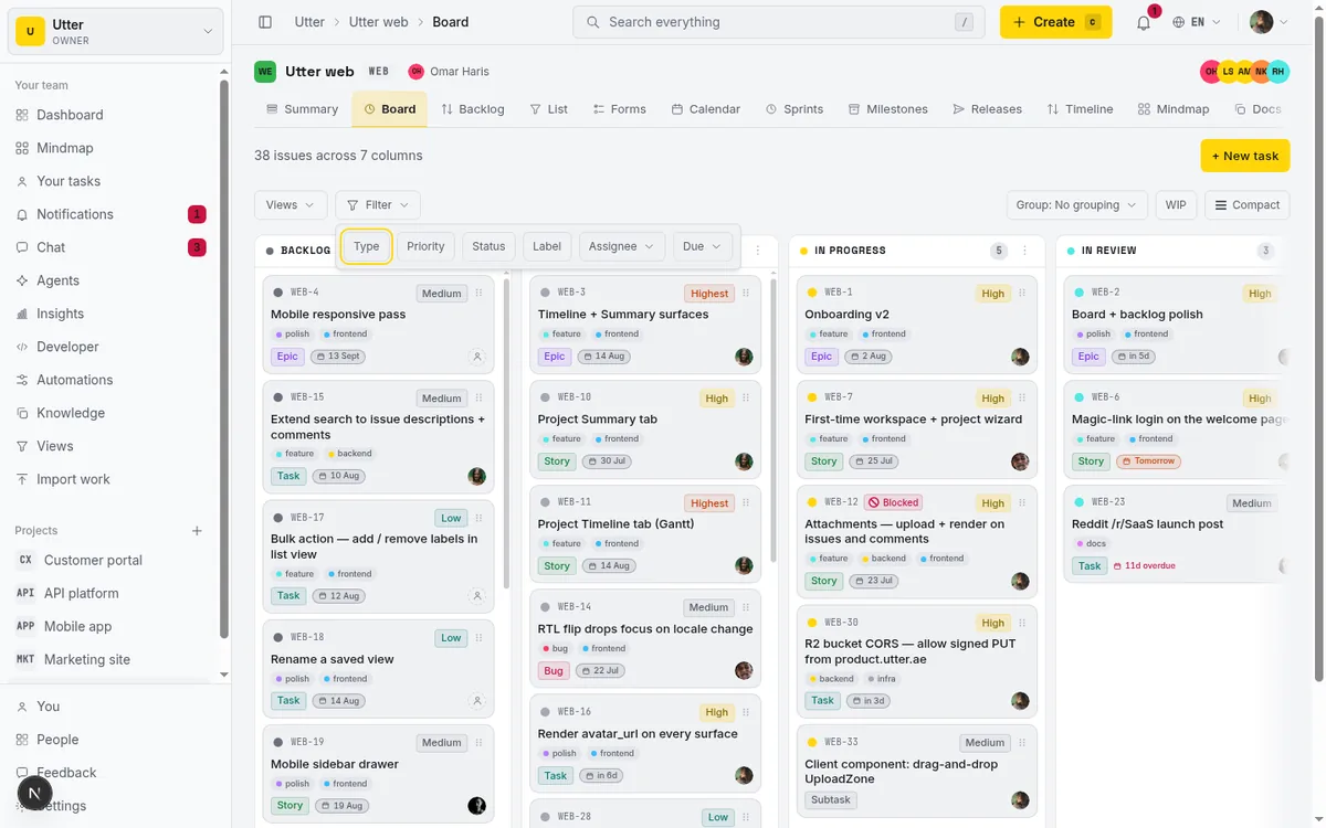
The Assignee facet has quick presets: Anyone, Assigned to me, Unassigned, or a specific team member with their avatar. "Assigned to me" plus Overdue is the filter I reach for most. It's the honest answer to "what's mine and late." If you find yourself leaning on assignee and priority constantly to work out who should be doing what, that's exactly the gap AI issue triage that assigns and prioritizes is meant to close.
Honest limit here, because it'll confuse you otherwise: the Milestone, Sprint, Release, and Label facets only render when the project actually has those things. A bare project with no sprints, no releases, no labels shows only Type, Priority, Status, Assignee, and Due in the popover. Nothing is broken. There's just nothing to filter on yet.
Saved Views. Once you've dialled in a filter combination you keep coming back to, save it as a View. A View can be Personal (only you see it) or Shared with the project (everyone gets it). "My overdue work" is a good Personal view. "Release-blocking bugs" is a good Shared one the whole team can click into.
There's a catch worth knowing before you rely on it. Saved Views round-trip only the core facets: types, priorities, statuses, labels, and assignee. In URL terms, a View carries the filter params, the ones that look like this:
GET /w/utter/p/web/board?types=bug&priority=critical,high&assignee=meThey do not save your board-only layout preferences. Density, group-by, the WIP overlay, and sprint scope live in the URL, not in the View:
GET /w/utter/p/web/board?density=comfortable&swim=assignee&wip=1So a saved View restores what you're filtering to, not how the board is laid out. If you paste someone a link with those layout params in the URL, the layout comes along. The saved View alone won't carry it.
Swimlanes. The Group control adds swimlanes inside each column. You can group by Assignee, Priority, or Type, or turn it off with No grouping. Each lane gets a header with a label and a count, and cards keep their rank order inside the lane.
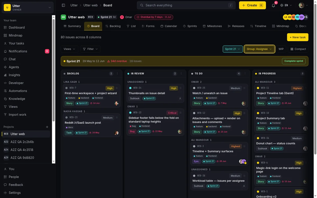
Read this one carefully, because the name oversells it. Grouping makes lanes within each column. It does not rebuild the board into columns-by-assignee. Group by Assignee and you still have your Backlog, To Do, In Progress columns. Each one is now internally divided into a lane per person. That's genuinely handy for a standup ("what's Sara got in flight across every stage?"), but it is not a swap of your process columns for people columns. If you expected the second thing, the first will surprise you.
WIP limits and workflow rules: the toolbar toggle vs the real setting
Read this section twice, because two completely different things share the name "WIP" and the difference will bite a team that doesn't know it.
Thing one: the toolbar WIP toggle. There's a "WIP" button in the board toolbar. Turn it on and columns show soft work-in-progress limits: In progress caps at 4, In review at 3, and every other category (Backlog, To do, Done, Failed, Cancelled) is uncapped. When a column goes over its cap, its count pill turns into an "n/limit" warning chip (like "6 of WIP limit 4") and the column border tints to catch your eye.
Now the part people get wrong. Those numbers are hard-coded and category-based. The toggle does not read the WIP limits you configured in settings. And it does not stop anything. Going over a toolbar WIP limit is purely visual: the pill turns into a warning, the border tints, and the card drops in anyway.
There is no board-side enforcement. It's a nudge, a "hey, you've got a lot in flight," not a gate. Do not tell your team the toolbar reflects the limits they set, because it doesn't, and someone will eventually notice the board let them sail straight past a "limit" they thought was real.
Thing two: the real per-status settings. The actual configured WIP limit and the actual transition rules live in Project settings, on the Board statuses tab. Two cards there do the work: the statuses manager (the list of your columns) and the Workflow card. Each status gets:
- A "Can move to" set. The default is "All statuses" (Linear-style, go anywhere). Restrict it to build a Jira-style enforced process, where a card can only advance along the paths you allow. Options run from "Allow all statuses" down to "No outgoing moves (terminal)" for a genuine end state.
- A numeric "WIP limit", defaulting to None.
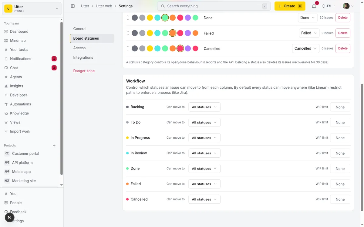
Side by side, so nobody on your team confuses the two again:
| Toolbar WIP toggle | Settings WIP limit | |
|---|---|---|
| Where it lives | Board toolbar button | Project settings, Board statuses tab |
| The numbers | Hard-coded by category: In progress 4, In review 3, rest uncapped | Whatever you set per status, default None |
| Reads your settings? | No | It is the setting |
| Over the limit | Warning chip and tinted border, card drops in anyway | Your configured number, separate from the overlay |
Here's the asymmetry that trips people up. The transition rules are enforced, server-side, on every status write including board drags (that's the "Blocked by workflow" toast from earlier). The per-status WIP limit you set here is the real, configured limit, and it's separate from the toolbar overlay's hard-coded 4-and-3.
So you have one WIP concept that's a visual nudge (the toolbar) and another that's a configured setting (project settings), and they don't talk to each other. When someone on your team says "the board enforces WIP," ask which one they mean. Sprint scope, which ties into all of this, is worth reading about in running sprints without the ceremony.
Sprint scope, density, and the mistakes people make
The last handful of controls are smaller, but they're where day-to-day comfort lives, and this is also where the remaining honest limits go so they're all in one place.
Sprint scope. When a project has sprints, a scope switcher appears: All issues, Backlog only (nothing scheduled into a sprint), or a specific sprint. The active sprint carries an "Active" badge, and the board defaults to it when it has issues, so you land on the work in flight rather than the whole backlog.
You also get an active-sprint banner across the top: sprint name, date range, days left (or how far overdue), and the issue count. With permission, that banner has a Complete button. Completing opens a dialog to move any incomplete issues to another sprint or back to the backlog, and optionally notify their assignees, so closing a sprint doesn't silently strand half-done work. No sprints on the project? No scope switcher and no banner. It only shows up when there's something to scope.
Density. Two states, Compact and Cozy. Compact is the default and packs more cards into the viewport. Cozy gives them more breathing room. That's the whole choice. There is no third, looser density, so don't go hunting for one.
Quick edits without leaving the board. You don't have to open an issue to change small things. Each card has a "..." menu (Quick edit) on hover or focus that lets you change Status, Priority, Assignee, or toggle Labels in place. You can also click the chips directly on the card face: click the status dot to change status, the priority badge to change priority, the assignee avatar to reassign.
All of it is optimistic with rollback if the write fails, same as dragging. And when a workflow restricts transitions, the status picker here only offers the allowed targets, so quick-edit respects your rules even though the drag preview doesn't.
One limit on that. Multi-assignee editing is not on the card. A card with two or more assignees shows a read-only overlapping avatar stack. The click-to-edit assignee chip only appears on cards with zero or one assignee. To manage the full set of assignees, open the issue and use its detail rail. The card gives you fast reassignment for the simple case and gets out of the way for the complex one.
A couple of layout notes so your screenshots and your expectations line up. The Group, WIP, and Density controls are hidden on small screens, so drive those from a desktop width. And on phones, columns render at roughly 86vw and snap as you swipe, with edge-fade shadows on the sides when the strip overflows.
The mistakes I'd warn a new team about, gathered in one place:
- Trusting the toolbar WIP as enforcement. It's a visual nudge. It never blocks a drop. If you want a real cap, that's a conversation and a settings change, not the toggle.
- Adding too many columns. Every column you add is a column everyone has to scan. Backlog, To Do, In Progress, In Review, Done covers most teams. Add a sixth only when a real stage exists that people keep asking about.
- Deleting a column you thought was empty. Read the archived-count in that "Column deleted. {count} issues archived." toast. Soft-deleted issues are recoverable for 30 days, but only if you notice in time.
- Expecting a saved View to remember your density and grouping. It won't. Views carry facets. Layout lives in the URL. Bookmark the URL if you want the layout too.
If agents or automations are moving cards on your board, keep a person in the loop on the moves that matter. Human-in-the-loop approval for AI agents covers how to set that up without slowing everyone down.
That's how to use a kanban board in Utter, from reading a card to bending the columns around your real process. The fastest way to make it stick is to stop reading and go move one card. Open your board and drag something to Done.
Frequently asked questions
Where is the kanban board in Utter and how do I open it?
Each project has its own board at /w/[workspace]/p/[project]/board. The columns you see are that project's custom statuses in rank order; the demo WEB project ships with 7 default columns (Backlog, To Do, In Progress, In Review, Done, plus the Failed and Cancelled category columns). The header shows a live count like "42 issues across 7 columns" so you know the board loaded and how much is open.
How do I move a task from one column to another on a kanban board?
Drag the card into the target column and drop it. That changes the card's status; the move is optimistic (it happens instantly on screen) and persists the new status plus its position in the column. Drag a card up or down within a column instead to re-rank it without changing status. If a move fails, the card snaps back and a toast explains why (a permission issue, a transient error, or a workflow rule). Moving cards needs issue edit permission; viewers get a read-only board.
Can I move kanban cards with the keyboard instead of the mouse?
Yes, and it's a full path. Tab to focus a card, press Space or Enter to pick it up, use the arrow keys to move it between and within columns, press Space or Enter again to drop, and Escape to cancel. Each step is announced through an aria-live region for screen readers.
How do I add a new column to my kanban board, and who is allowed to?
Use the trailing "+ Add status" lane at the right end of the board: set a Status name, pick a Category (Backlog / To do / In progress / In review / Done / Failed / Cancelled), and choose a colour from 8 preset swatches or a custom hex picker. This needs the project edit-settings permission, so it's admins and owners who see it at all, not regular members or viewers.
What happens to the tasks in a column if I delete that column?
Deleting a non-empty column soft-deletes the issues in it. A confirm dialog warns you first, and after you confirm, a toast reports how many were archived ("Column deleted. {count} issues archived."). Those issues are recoverable for 30 days. The board also refuses to delete a project's last remaining column.
Do the WIP limits on the board actually stop me from adding too many cards?
No. The board's WIP overlay is purely visual: when a column goes over its limit, its count pill becomes an "n/limit" warning chip and the border tints, but the card still drops in. There is no board-side enforcement of WIP limits.
What is the difference between the WIP toggle on the board and the WIP limit in project settings?
The toolbar "WIP" toggle shows hard-coded, category-based soft limits (In progress = 4, In review = 3, everything else uncapped) and is a visual nudge only. The per-status "WIP limit" in Project settings, Board statuses tab, is a separate value you configure per column (default None). The toolbar overlay does not read or reflect the limits you set in settings, so don't treat it as your configured limit. In the same settings area, the "Can move to" transition rules are enforced on every status change, including board drags.
How do I filter a kanban board by assignee or due date, and can I save the filter?
Open the Filter popover. For assignee, pick a preset (Anyone, Assigned to me, Unassigned) or a specific member. For dates, use the Due quick-filter (Any due date / Overdue / Due this week / No due date). The Filter button shows a badge counting active facets, and Clear resets them. Save a combination as a View, either Personal (only you) or Shared with the project. Note that a saved View round-trips only the core facets (types, priorities, statuses, labels, assignee); density, grouping, WIP, and sprint scope live in the URL, not the View.
Related reading
How to add board columns
Add, rename, reorder, and delete kanban board columns in Utter: statuses, categories, colours, permissions, and the delete gotchas, with the limits named.
July 15, 2026 · 15 min read
How to read the project summary
Read the Utter project Summary tab like a pro: what every card shows, how each number is computed, what good looks like, and where the dashboard stops.
July 15, 2026 · 16 min read
Project reports and insights
Read Utter's project reports and dashboards: Summary KPIs, sprint burndown, cycle time, throughput, workload, and workspace Insights, with the honest limits on each.
July 15, 2026 · 16 min read
Custom workflow statuses
Build custom Jira-style board columns in Utter and enforce status transition rules across the board, API, bulk edits, and automations. With the honest limits.
July 15, 2026 · 18 min read
How to use the mindmap
How to use Utter's project mind map view: open the radial tree, read the pills, expand and filter branches, group by Hierarchy/Status/People, and export a PNG.
July 15, 2026 · 14 min read

How to filter and sort issues
Filter issues by assignee, label, and status in Utter's list view, then sort, group, save a view, and share the exact filtered list as a URL.
July 15, 2026 · 16 min read
Project calendar view
Open Utter's Calendar tab to see project due dates on a month or week grid, drag deadlines to reschedule, edit status inline, and filter by assignee.
July 15, 2026 · 13 min read

See your whole project as a mind map (and when it beats a nested list)
A nested list hides how work relates. A mind map shows it. When a map of your epics and stories helps, when a list is better, and how Utter's does it.
July 5, 2026 · 7 min read
A Trello alternative for when a board stops being enough
Trello alternative comparison: what breaks when a board stops being enough, an honest Trello vs Utter pricing and feature comparison as of July 2026, and how to keep the board while adding sprints, a ranked backlog, and reports.
July 16, 2026 · 12 min read

How to search your workspace
Search issues across projects in Utter from one top-bar field: the / shortcut, live typeahead, WEB-12 key-jump, the full results page with Type/Status/Priority filters, and the real limits.
July 15, 2026 · 14 min read
Add a comment
Start the conversation.