
Project reports and insights
You shipped the sprint. The board looks tidy, every card sits in Done, and then someone asks the one thing a clean board can't answer: is the team actually on track, or did this week just break your way? A tidy board is not a healthy project. To know the difference you need the numbers, and in Utter the numbers behind project management reports and dashboards live in three specific places you can open right now.
This walkthrough uses the demo project WEB as the running example. By the end you'll open a Summary dashboard and read it in under a minute, tell the three reporting surfaces apart, read a burndown and a cycle-time histogram without fooling yourself, switch the reporting window, export a CSV, and use the workload and overdue views to fix real problems instead of admiring charts.
What you'll learn
- Open your project's Summary dashboard and read the Open / Done / Done % KPIs and the Status donut fast.
- Tell the difference between the Summary snapshot, the nine Reports cards, and workspace-wide Insights, and know which one answers which question.
- Read a sprint burndown, a cycle-time histogram, and a throughput chart correctly, with the honest limit on each.
- Switch the Week / Month / Quarter window on Reports and Insights, and export any report card as a CSV.
- Use the Workload and At risk / Overdue cards to act on what's actually wrong.
Where project management reports and dashboards live in Utter
Here's what trips people up on day one: project management reports and dashboards in Utter are not one screen. They are three surfaces, each answering a different question. Reaching for the wrong one is exactly why people say "I can't find the report I want."
| Surface | Where | Question it answers | Window |
|---|---|---|---|
| Summary | /w/<ws>/p/<proj>/summary |
How is this one project doing right now? | Live, recomputed every load |
| Reports | /w/<ws>/p/<proj>/reports |
How is this project trending? | Week, Month, or Quarter |
| Insights | /w/<ws>/insights |
How is my whole team doing? | Week, Month, or Quarter |
First is the project Summary. A whole-project snapshot. It's server-rendered and marked force-dynamic, which is the technical way of saying it recomputes on every load. What you see is current, not a cached guess from an hour ago.
Second is the project Reports page. Nine analytics cards plus a KPI row. It answers "how is this project trending over the last week, month, or quarter?" It's on every plan, and I'll come back to that because there's a stubborn myth that Reports costs extra.
Third is workspace Insights. Cross-project. It answers "how is my whole team doing across everything I can see?" When a lead asks who is overloaded across four projects at once, this is the surface, not Summary.
Rule of thumb: one project right now is Summary. One project over time is Reports. All projects, team health, is Insights. We'll open all three against WEB.
Reading the Summary dashboard at a glance
Open /w/utter/p/web/summary. Start at the top, because the top is built to be read in about ten seconds.
The header is a KPI trio. Open is total issues minus done minus cancelled, so it's the work genuinely still in flight, not padded by tickets you already killed. Done is a straight count of completed issues. Done % is done divided by total, rounded. Those three numbers are the fastest honest read on the project you'll get anywhere in the product.
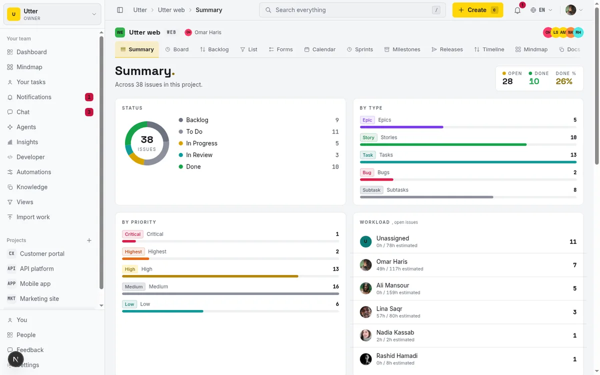
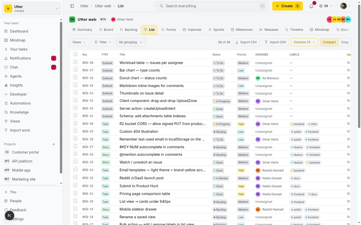
Below the KPIs sits the Status donut, a live picture of every non-deleted, non-archived issue grouped by status, with the total count printed in the center of the ring and a color-keyed legend beside it. One nice detail: only statuses that actually have issues get drawn, so you never see a dead zero-width sliver cluttering the chart. The colors are the per-status brand tokens you already know from the board (backlog, to do, in progress, in review, done, cancelled, failed), so the donut reads the same way your columns do.
Under the donut are two breakdown cards, By type and By priority. These are horizontal progress-meter bars, not a chart library, scaled so the largest bucket fills the row and everything else reads as a proportion of it. By type covers Epics, Stories, Tasks, Bugs, and Subtasks. By priority runs critical, highest, high, medium, low, lowest. This is where a bug-heavy sprint or a stack of untriaged critical tickets jumps out at you.
What does good look like here? By the last day of a sprint you want a fat Done slice and a thin Backlog. If Backlog is still the biggest slice at the end, the sprint was over-committed, and the donut told you before anyone had to admit it out loud.
Who is overloaded: the Workload and Velocity cards
Scroll down. The Workload card (its subtitle reads "open issues") lists each assignee with their avatar and their count of open issues, busiest person first. When an assignee's open issues carry time estimates, you also get an "Xh / Yh estimated" figure, so you see hours and not just ticket counts. An Unassigned bucket at the bottom holds work nobody owns yet. When the project is genuinely clear, the card reads "Everyone's caught up."
One caveat that matters: Workload is a point-in-time snapshot of current open work. It is not scoped to any date range. It answers "who is holding the most open work right now," full stop. If you want a period-based view, you're on the wrong card, and the Reports section below covers what is period-scoped and what isn't.
Next to it, the Velocity card shows six calendar-week bars of issues that reached Done, each bucket aligned to its week start on a Monday and labelled by that date. This is a fixed six-week window. It does not respond to any period selector, because Summary has no period selector at all. That control only lives on Reports and Insights. So Velocity here is always the last six weeks, no more, no less.
The Recently completed card lists the last six issues that hit Done, newest first, each a deep link with a relative timestamp so you can click straight through to "what did we just finish." Handy for a standup: open Summary, read the last six things off the card, move on.
If you want velocity to mean something rather than just watching a bar move, the mechanics of running the cycle that feeds it are worth reading: how to run a sprint.
Internalize one rule now, because it recurs everywhere in reporting. "Completed" means status Done only. Issues you cancelled or that failed are resolved, but they are not completed, so they never count toward velocity. That's deliberate. It keeps the number honest.
The cards that say act now: At risk / Overdue and Recent activity
Charts tell you the shape of things. The next two cards tell you what to do this afternoon.
The At risk / Overdue card lists open issues that are already overdue or due within the next three days, soonest deadline first, up to 100 rows. The header carries two tallies, "N overdue" and "N due soon," and here's the well-built part: those counts are computed in SQL over the full set, not from the visible rows. So even if the list truncates at 100, the header still gives you the true totals. If it says 40 overdue and you only see 100 rows, you're not missing the count, only the tail of the list.
This is the card you scan first thing Monday. Say WEB has a ticket like "Timeline + Summary tab" sitting overdue at the top of the list. That's not a chart to admire. That's a conversation to have with its assignee before lunch.
The Recent activity feed underneath shows the eight latest events: who created something, changed a status, set a priority, renamed a ticket, assigned or unassigned it, commented, or deleted a comment. Each event carries the actor's avatar and a deep link to the issue. Between At risk and Recent activity you get the two halves of a working dashboard that happen to be lists, not graphs: what's going wrong, and what just happened.
Sprint burndown and cycle time: the harder charts
Two cards reward a bit of study, Sprint burndown and Cycle time, because both are easy to misread if you don't know how they're built.
The Sprint burndown card is a real Recharts line chart. It plots remaining work against an ideal reference line for the active sprint, or the most recent active or completed one if none is running now. Two KPI tiles sit beside it, Committed and Remaining. The unit is smart: if any issue in the sprint carries an estimate, the chart measures in estimate minutes; if none do, it falls back to a plain issue count. No sprints in the project? The card shows "Start a sprint to see a burndown" and nothing else, because there's genuinely nothing to draw.
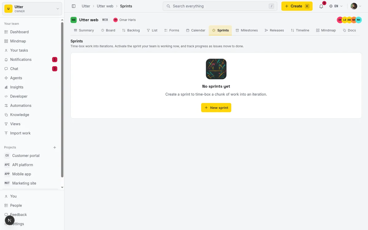
How do you read it? The ideal line is the straight glide from full commitment down to zero across the sprint. Your actual remaining-work line should track near it. When your line sits stubbornly above the ideal for days, you're behind, and the flat stretches show where nothing closed at all. A burndown that stays high and then plunges over the last two days is not a healthy sprint. It's a sprint where everything got marked done at the buzzer. The chart makes that pattern impossible to hide.
The Cycle time card is a bespoke histogram. Three KPIs up top, Median, p75, and Sample, then a distribution across fixed buckets: under 1 day, 1 to 3 days, 3 to 7 days, 1 to 2 weeks, and 2 weeks plus. Read the footnote, because the measurement basis is auto-chosen:
flowchart TD
    A[Sample the 5000 most recently resolved issues] --> B{At least half have a recorded move into In Progress?}
    B -- yes --> C[Measure first In Progress to Done]
    B -- no --> D[Measure creation to Done, which is lead time]
    C --> E[Footnote states the basis used]
    D --> E
The footnote states which basis was used, so never assume it's fixed. The sample is capped at the 5000 most-recently-resolved issues, representative rather than an exhaustive scan on a huge project, and Median and p75 are computed over that sample.
The practical read: median tells you the typical ticket, p75 tells you the slow tail. If median is two days but p75 is two weeks, most work moves fast and a minority is getting stuck, and that gap is the thing to investigate. If you're planning sprints and want to reason about what your cycle time implies for commitment, this pairs with what actually works in AI sprint planning.
The Reports page: nine cards and the Week / Month / Quarter window
Now open /w/utter/p/web/reports. First, kill the myth. Reports are not paywalled. They ship on every plan. There's a leftover, unused string in the codebase that once read "Reports are a Pro feature," but the page itself, and its own header comment, state plainly that reports are available on every plan. If anyone tells you that you need Pro or Business to see reports, they're wrong.
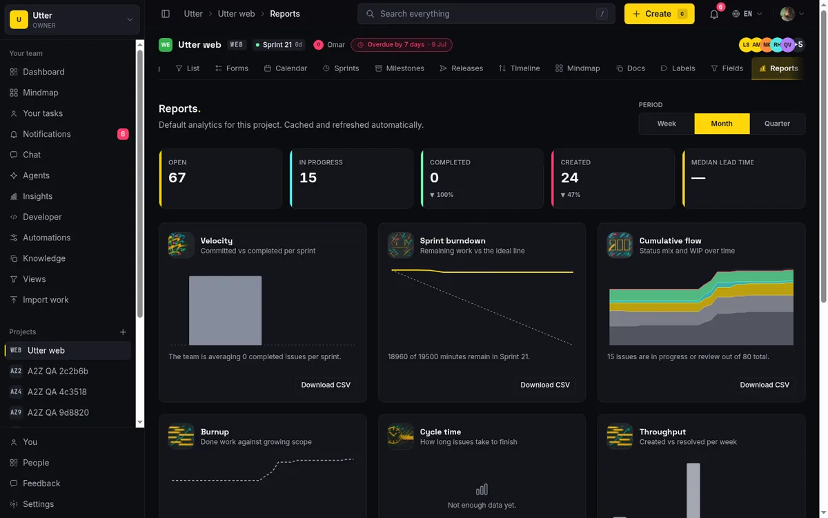
At the top of Reports is the Period selector: Week (7 days), Month (30 days, the default), and Quarter (90 days). It's URL-driven via ?period=, so any window is a shareable link, and it drives every card and KPI on the page.
The KPI overview row gives you five numbers, four with a trend arrow comparing against the previous period. Open, In progress, Completed (green when up), Created (also trended), and Median lead time in days. When there's no prior period to compare against, you get a "new" badge instead of an arrow. That's honest, rather than showing a fake zero baseline.
Below that is the grid of nine cards, each with brand art, an inline chart, a one-line plain-language insight, and a Download CSV button:
- Velocity, committed vs completed per sprint.
- Sprint burndown, remaining vs ideal.
- Cumulative flow, status mix and WIP over time.
- Burnup, done work against growing scope.
- Cycle time, how long issues take to finish.
- Throughput, created vs resolved per week.
- Status breakdown, issues created in the period by status.
- Type breakdown, issues created in the period by type.
- Workload, open issues by assignee.
A detail that saves clicks: the segments in the breakdown and workload cards are links. Click a status, type, or assignee segment and you land in the project List view already filtered to it. A report isn't a dead end. It's a jumping-off point into the actual tickets.
What each report answers, and exporting to CSV
Set the window to Quarter and walk the cards, because the differences between them are exactly where people misread the data.
Cycle time answers how long issues take to finish, same basis logic as the Summary card. Throughput plots created vs resolved per week, and reading the two lines together is the whole point: if created keeps outrunning resolved, your backlog is quietly growing no matter how busy the team looks.
Now the trap. Status breakdown and Type breakdown count issues created within the selected period. Workload is point-in-time, current open work, not period-scoped. So on a Quarter window, Type breakdown means "what did we open in the last 90 days," while Workload means "what's open right now." Mixing those two up is the single most common reporting mistake. Now you won't make it.
Cumulative flow and Burnup need a fair warning. Both depend on daily status snapshots captured by a background worker. Only today's point is live:
flowchart LR
    W[Background worker] -->|captures daily| S[Status snapshots]
    S --> C[Cumulative flow]
    S --> B[Burnup]
    T[Today] -->|live point| C
    T -->|live point| B
A brand-new project, or one with no captured history yet, shows just a single point until snapshots accumulate over the following days. That's not a bug and not a broken chart. It's a diagram that needs history to exist before it can draw a trend. Give it a few days.
Every card has Download CSV, and the export is built right in the browser from data the page already computed, so it's instant, with a filename like <slug>-<report>-<period>.csv. A WEB throughput export on the Quarter window comes down as something like web-throughput-90d.csv, ready to drop into a spreadsheet.
And if you'd rather automate it, the same computed payloads are readable per report over the public v1 API, in JSON or CSV, so you can pull a project's numbers into your own tooling without scraping a page. The nine report ids the endpoint accepts:
["velocity", "burndown", "cumulative-flow", "burnup", "cycle-time",
 "throughput", "status-breakdown", "type-breakdown", "workload"]
Fetching one takes a single GET with an API key that has the projects:read scope. With curl:
curl -H "Authorization: Bearer utp_live_xxxxxxxx" \
  "https://utter.ae/api/v1/workspaces/utter/projects/WEB/reports/throughput?period=90d"
const res = await fetch(
"https://utter.ae/api/v1/workspaces/utter/projects/WEB/reports/throughput?period=90d",
{ headers: { Authorization: "Bearer utp_live_xxxxxxxx" } },
);
const { data } = await res.json();
console.log(data);import requests
r = requests.get(
"https://utter.ae/api/v1/workspaces/utter/projects/WEB/reports/throughput",
headers={"Authorization": "Bearer utp_live_xxxxxxxx"},
params={"period": "90d", "format": "csv"},
)
open("web-throughput-90d.csv", "w").write(r.text)period accepts 7d, 30d, or 90d and defaults to 30d, matching the Week / Month / Quarter selector on the page.
Once you can read throughput and cycle time honestly, the natural next move is fixing what they reveal, and a lot of that starts with what you choose to work on: how to prioritize your backlog.
Stepping up to workspace Insights: team health across projects
One project is a narrow view. When you lead more than one, open /w/utter/insights. Insights is a cross-project aggregate over every project you can reach, with the same Week / Month / Quarter selector you know from Reports.
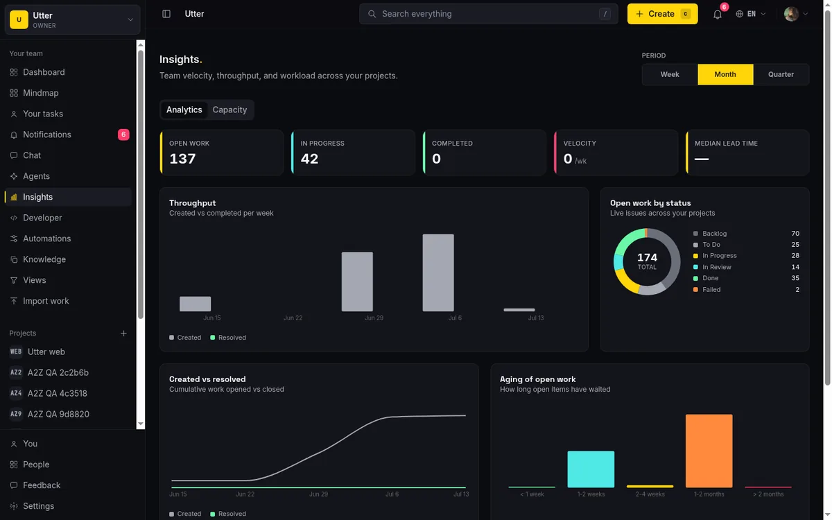
The Analytics tab opens with five KPIs spanning all your projects at once: Open work, In progress, Completed, Velocity /wk, and Median lead time. Below them: a Throughput bar chart (created vs completed per week), an Open work by status donut, a Created vs resolved cumulative line showing work opened against work closed over time, an Aging of open work bar chart bucketed by <1 week, 1-2 weeks, 2-4 weeks, 1-2 months, and >2 months, and a Work by type distribution.
Aging is the sleeper chart here. It answers a question no single-project view asks well: how long has your open work been sitting? A tall ">2 months" bar means you have stale tickets rotting across projects, the kind that quietly never close. Better to see that stacked up in one place than to discover it project by project, one surprise at a time.
Two honesty notes about scope. Insights is workspace-wide but hidden from guests entirely; they get a 404. And what you see depends on your role: owners and admins see every project, while members and viewers see only projects they can reach. So the aggregate reflects what you can reach, not necessarily the entire workspace. If your numbers look smaller than a colleague's, that's usually why, and it's by design rather than a discrepancy.
Capacity planning: reading Open / total across the team
Switch to the Capacity tab. This is the one to open before you commit a sprint, not after.
Capacity shows open-work load per assignee across all your reachable projects: Open work bars plus an Open / total column, and when issues carry estimates it becomes "Open / total · est." with hours. There's an Unassigned row for open work nobody owns. It lists the busiest 20 assignees, stated plainly on the card as "Showing the busiest 20 assignees."
Use it like this. Before you assign the next batch of tickets, glance down the Open work bars and find the person already carrying, say, 15 open items. That's the moment to not hand them the sixteenth. Capacity turns "I think Sara is busy" into "Sara has 15 open across three projects and 22 estimated hours," which is a much harder thing to argue with in planning.
Same two caveats as Workload, worth repeating because they're easy to forget: Capacity is a point-in-time snapshot of current open work, not period-scoped, and it caps at 20 assignees, so it isn't a full roster. It's a "who is loaded right now" view, which is exactly what capacity planning needs. If you're pairing this with a pull-based flow where people take work rather than get assigned it, how to use a kanban board is the companion piece.
The limits worth knowing before you trust a number
Every reporting tool has edges, and a report you trust blindly is more dangerous than no report. Here are the honest constraints, so you know when a number is telling the whole truth and when it isn't.
| Limit | What it means in practice |
|---|---|
| No custom report builder | The nine cards are opinionated defaults; you can't assemble your own. |
| No custom date range | Only 7, 30, and 90 days. "Last fiscal quarter to the exact date" isn't a thing here. |
| No scheduled email | If you want a cadence today, pull the data over the public API. |
| ~2 minute cache | A change from thirty seconds ago may lag briefly. Summary is the exception; it recomputes every load. |
| Snapshot-dependent charts | Cumulative flow and Burnup show a single point on a new project until daily history builds up. |
| Sprint-dependent charts | Velocity, Sprint burndown, and the current-sprint cards stay empty without sprints. |
The most important one to keep in your head: Completed means status Done only. Cancelled and failed issues are resolved but not completed, and they're excluded from throughput, velocity, cycle time, and the Completed KPI. Cancelled work still appears as its own slice in the status donut, so it stays visible; it just doesn't inflate your throughput. That's the right call. A team that cancels ten tickets did not ship ten tickets.
Cycle time is sampled at the 5000 most-recently-resolved issues, and its basis is auto-chosen between In-Progress-to-Done and creation-to-Done, with the footnote telling you which. So on a very large project it's a representative sample, not a full census, and the basis isn't a fixed thing you can assume. And Workload and Capacity are point-in-time, never period-scoped, so don't read them as "this month's load."
None of these are reasons to distrust the numbers. They're the difference between reading a chart and understanding it. Open your own project's Summary dashboard and read the top three KPIs. That's a good first minute, and everything above tells you where to look next.
Frequently asked questions
Where do I find reports and dashboards in Utter?
Three places. The project Summary at /w/<ws>/p/<proj>/summary is a live whole-project snapshot. The project Reports page at /reports has nine trend cards plus a KPI row over a Week, Month, or Quarter window. Workspace Insights at /w/<ws>/insights aggregates across every project you can reach. Summary for right now, Reports for over time, Insights for the whole team.
Do project reports cost extra or require a Pro or Business plan?
No. Reports are available on every plan, with no paywall. There's an old, unused piece of text in the codebase that once implied otherwise, but the Reports page itself and its own code comment confirm every plan gets them.
Why is my sprint burndown or velocity chart empty?
Because the project isn't using sprints. Velocity, Sprint burndown, and the current-sprint cards all need at least one active or completed sprint to draw anything. Without a sprint, you get the "Start a sprint to see a burndown" empty state, and the current-sprint strip on Summary doesn't show up at all. Start a sprint and the charts populate.
What's the difference between the Summary dashboard, Reports, and Insights?
Summary is a single project, right now, refreshed on every load. Reports is a single project over a chosen 7, 30, or 90 day window, with trend arrows and CSV export. Insights is cross-project, aggregating team health across everything you can reach. Different scope, different question, same underlying data.
Why does my cumulative flow diagram only show one data point on a new project?
Cumulative flow and Burnup are built from daily status snapshots captured by a background worker. On a brand-new project there's no history yet, so only today's point exists. Leave it a few days and the snapshots accumulate into a real trend line. This is expected, not a fault.
Are cancelled or failed issues counted as completed in velocity and throughput?
No. Only issues with status Done count as completed. Cancelled and failed issues are resolved but excluded from throughput, velocity, cycle time, and the Completed KPI. They still appear as their own slice in the status donut and breakdowns, so they stay visible without inflating your delivery numbers.
Can I change the date range on reports or export them?
You can switch between Week (7 days), Month (30 days), and Quarter (90 days) on Reports and Insights, and the choice lives in the URL so it's shareable. There's no custom date range beyond those three. Every report card has a Download CSV button that builds the file in your browser instantly, and the same data is available over the public v1 API in JSON or CSV.
How is cycle time measured, and does it scan every issue?
It samples the 5000 most-recently-resolved issues in the window, not every issue on a very large project. The basis is auto-chosen: if at least half the sample has a recorded move into In Progress, it measures from that first In Progress transition to Done; otherwise it falls back to creation-to-Done, which is lead time. The card footnote always states which basis was used, and Median and p75 are computed over that sample.
Related reading
How to read the project summary
Read the Utter project Summary tab like a pro: what every card shows, how each number is computed, what good looks like, and where the dashboard stops.
July 15, 2026 · 16 min read
How to use a kanban board: a complete guide with a real example
Learn how to use a kanban board in Utter: read cards, drag tasks between columns, add and reorder custom columns, set WIP limits, filter, and save views.
July 15, 2026 · 20 min read
Project calendar view
Open Utter's Calendar tab to see project due dates on a month or week grid, drag deadlines to reschedule, edit status inline, and filter by assignee.
July 15, 2026 · 13 min read
How to use the mindmap
How to use Utter's project mind map view: open the radial tree, read the pills, expand and filter branches, group by Hierarchy/Status/People, and export a PNG.
July 15, 2026 · 14 min read
Stop chasing status updates: let AI write the weekly project digest
How to automate a weekly status report with AI that reads what actually moved and what stalled, instead of a dumb scheduled dump of ticket counts.
June 1, 2026 · 7 min read
See your whole project as a mind map (and when it beats a nested list)
A nested list hides how work relates. A mind map shows it. When a map of your epics and stories helps, when a list is better, and how Utter's does it.
July 5, 2026 · 7 min read
Notifications and watching issues
Set up Utter notifications and watch issues: the four events that notify you, who gets pinged, inbox triage, snooze and archive, and email vs in-app.
July 15, 2026 · 16 min read
Custom workflow statuses
Build custom Jira-style board columns in Utter and enforce status transition rules across the board, API, bulk edits, and automations. With the honest limits.
July 15, 2026 · 18 min read
How to use the ai assistant
How to run your board with Utter's AI assistant: ask grounded questions, create and triage issues from a sentence, and approve every change before it lands.
July 15, 2026 · 14 min read

How to search your workspace
Search issues across projects in Utter from one top-bar field: the / shortcut, live typeahead, WEB-12 key-jump, the full results page with Type/Status/Priority filters, and the real limits.
July 15, 2026 · 14 min read
Add a comment
Start the conversation.