
Gantt chart with dependencies
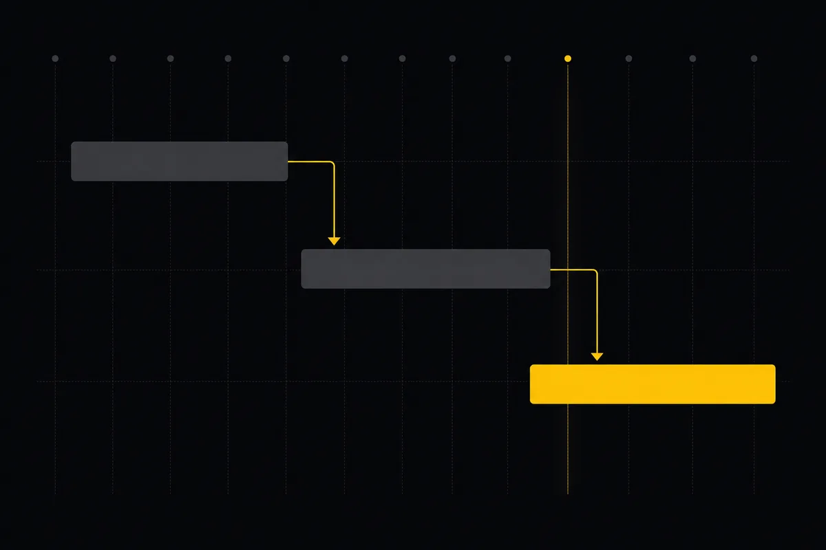
You have start dates and due dates sitting on your issues, but no way to see the shape of the plan. Which task is waiting on which. Where the crunch lands. Who is buried under three overlapping bars in the same week. Dates in a field are invisible until you plot them against time. That is the job of the Timeline tab: it turns every dated issue in a project into a gantt chart with dependencies, so you can see the plan and reschedule it by hand.
This walkthrough covers the whole surface. How to read the chart, how to drag work around, how to draw the arrows between tasks, and, just as usefully, what the Gantt deliberately does not do so you never build a plan around a feature that isn't there.
What the Gantt timeline actually is
Open any project and click the Timeline tab. The route is /w/[ws]/p/[project]/timeline, sitting right next to Board, Backlog, and List. What loads is a two-part layout.
On the left is a fixed label column headed Issue: one row per issue, each showing the type badge, the KEY-NUMBER, and the title. On the right is a scrollable time canvas. Every issue that has a start date, a due date, or both becomes a horizontal bar, positioned by date across a day grid with lighter week gridlines. A yellow vertical marker shows today, and the canvas auto-scrolls so today lands in view the moment the page loads. You are not hunting for the current week. It finds you.
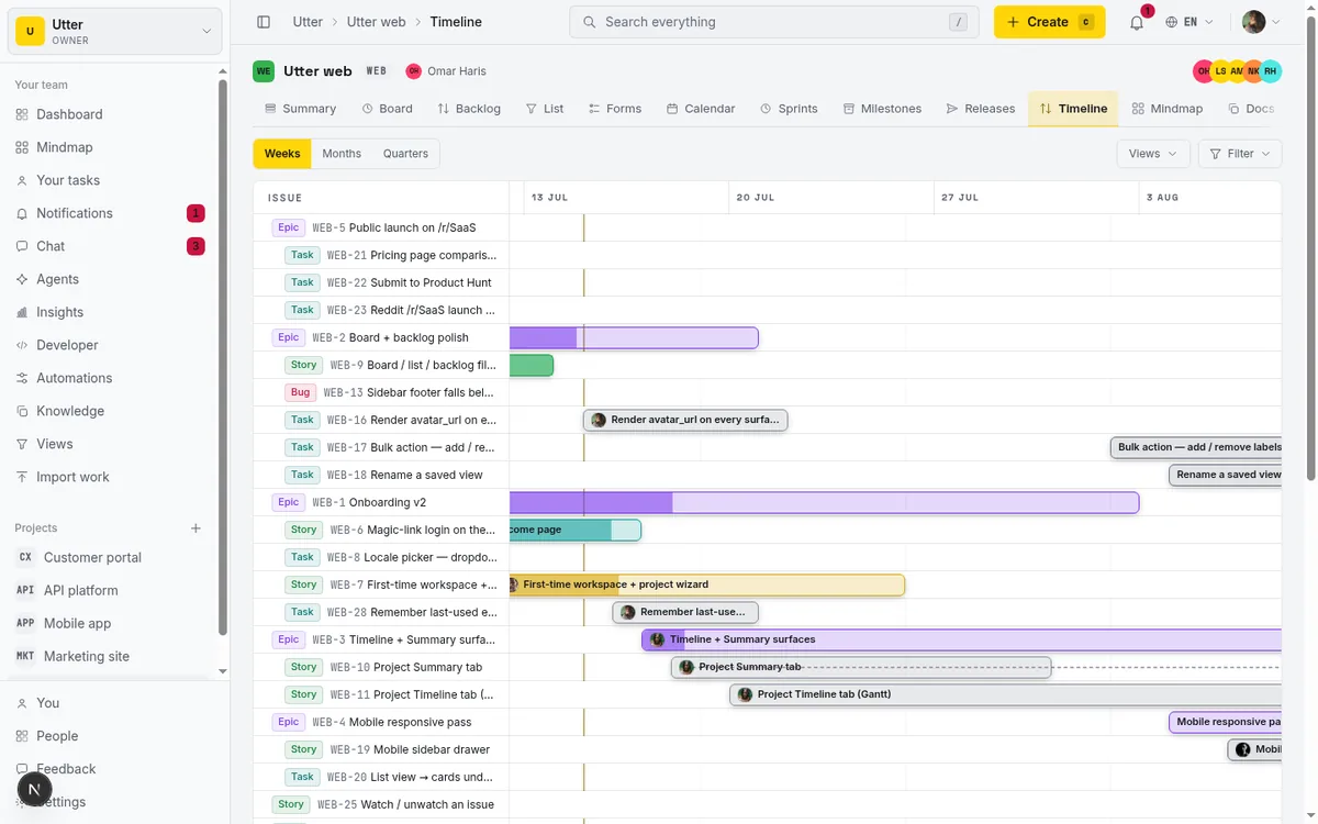
One rule governs everything below: only dated issues draw bars. An issue with no start and no due date has nothing to position, so it does not render a bar. It still appears (more on scheduling those shortly), but the drawn Gantt is a picture of work that already lives somewhere in time. That constraint is the whole logic of a gantt chart with dependencies, and it is where the rest of this tutorial happens.
Reading the timeline: epics, bars, and progress
The rows aren't in random order. Epics come first, each with its child issues indented underneath, so the plan reads like an outline: the big containers, then the work inside them. Issues with no parent (orphans) sit at the bottom. If your project is structured into epics, the timeline mirrors that structure with no extra effort from you.
Bars are colored by status, so a glance down the canvas tells you what stage each piece of work is in. Epic bars are the exception: they take the epic type color instead, which makes the container rows easy to pick out from the tasks nested under them.
Inside each bar there's a progress fill. It grows from the chronological-left edge in proportion to the issue's completion percentage, so a task marked 60 percent done shows a bar filled 60 percent of the way. Be precise about what that fill reads:
- It is the manual completion field on the issue, set by a person in the Time card.
- It is not computed from subtask counts.
- It is not inferred from which status column the issue sits in.
If you never touch the completion field, the fill stays empty even on work that is obviously moving. It's a number you set, not one the system guesses.
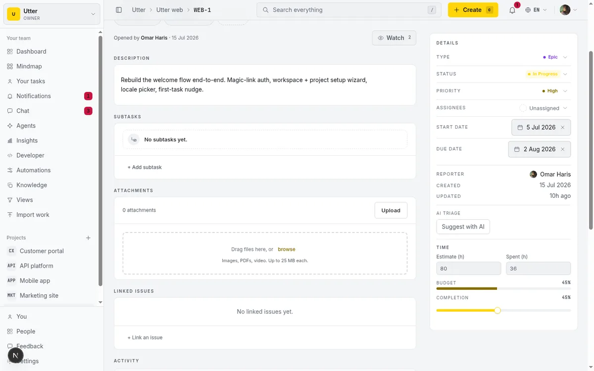
Take the WEB project. The "Timeline + Summary tab" ticket sits In Progress, so its bar carries the In Progress color, and because someone has been marking it along the way it shows a partial fill. Assignee avatars ride on the right end of each bar, so you can see who owns what without opening a thing. If an issue is assigned to an AI agent, its avatar picks up a small spark badge and an "(AI agent)" note in the tooltip, so human and agent work read differently at a glance.
Rescheduling work by dragging bars
Here's where the timeline earns its keep. Grab a bar and drag it left or right. Both dates move together, the duration stays fixed, and everything snaps to whole days (you can't land a task on half a Tuesday). The moment you drop it, the change saves optimistically through the same update path the rest of the app uses, and a small pulsing "Saving…" dot appears on the bar while it's in flight.
If the save fails for any reason, the bar snaps back to where it was and a toast tells you it reverted. You never end up looking at one thing while the database holds another.
flowchart LR
  A[Drag bar] --> B[Drop on a day]
  B --> C[Optimistic save]
  C -->|success| D[Bar stays put]
  C -->|failure| E["Bar snaps back, toast explains"]
To change just one date, hover a bar and grab one of the edge handles that appear. The leading (start) edge resizes the start date; the trailing (due) edge resizes the due date. This is how you stretch or compress a task without moving it. One guardrail: the due edge can never collapse in front of the start day, so you can't accidentally invert a task into a negative duration.
What good looks like here is small and specific. A teammate has a brutal week coming and one of your bars overlaps it. Drag that bar two days right so it clears their crunch, watch the "Saving…" dot pulse and settle, done. No dialog, no date fields, no context switch.
The dates the drag writes are plain fields on the issue, so a script can reschedule too. The public API's issue update accepts start_at and due_at, with a bare YYYY-MM-DD treated as midnight UTC:
curl -X PATCH "https://utter.ae/api/v1/workspaces/utter/projects/WEB/issues/WEB-12" \
  -H "Authorization: Bearer utp_live_a1b2..." \
  -H "Content-Type: application/json" \
  -d '{"start_at": "2026-07-20", "due_at": "2026-07-24"}'
If you want to edit the work rather than reschedule it, click a bar without dragging. An inline popover opens for that issue's status, priority, and assignee, so you can reassign or bump priority right from the plan. The title and key link out to the full issue detail page when you need the rest.
One thing to know before you start dragging: it is gated by permission. Only people who can edit the issue (its reporter, its assignee, or anyone with the issue.edit_any permission) can drag, resize, schedule, or draw links. Everyone else gets a fully readable Gantt that simply doesn't respond to dragging. If your bars won't move, that is almost always why, and it's working as intended.
How to reschedule tasks with the keyboard
Dragging is fine with a mouse, but you don't always want to reach for one. Every bar is focusable, and once a bar has focus the arrow keys move it.
| Keys | What happens |
|---|---|
| Left | Whole bar moves one day earlier |
| Right | Whole bar moves one day later |
| Shift + Left | Due edge pulls in by one day |
| Shift + Right | Due edge pushes out by one day |
| Escape | Closes the dependency kind picker |
Shift plus an arrow is the keyboard equivalent of dragging the trailing (due) end handle. It's precise in a way dragging isn't: one key, exactly one day, no overshoot.
A detail that matters for Arabic and other RTL workspaces: the timeline canvas is pinned LTR regardless of locale. So Left always means earlier in time and Right always means later, even when the rest of the interface is mirrored. Time doesn't run backwards just because the UI does.
Now the honest caveat, because it will save you frustration. There is no keyboard way to create a dependency on the timeline. The link handle you use to draw an arrow is pointer-only and hidden from assistive tech, so keyboard and screen-reader users can't start a link from here. If you need to add or edit dependencies without a mouse, do it from the issue detail page in the Linked Issues panel instead. That path is fully keyboard-navigable, and the link it makes shows up on the timeline just the same.
Scheduling issues that have no dates yet
Undated issues never draw bars, but the timeline doesn't pretend they don't exist. Each one shows up as a row with a No dates pill on the canvas, and when you hover its label a + Schedule affordance appears. Click it and the issue gets default dates: today through today plus five days. From there you drag or resize the fresh bar into the real window you have in mind.
The flow is deliberately two-step. Scheduling drops the task onto the plan with a sensible starter shape, and then you refine it. In the WEB project this is the natural move for a Backlog ticket you've finally decided to commit to a date. It was sitting there dateless, you hit + Schedule, and now it's a real bar you can position against everything else.
There's a capacity ceiling worth knowing, because a busy project can carry a lot of issues. The timeline loads up to 1000 dated issues (your full scheduled plan) plus a bounded tail of up to 50 undated ones. Past that, you get a "showing first N of M" pill that links straight to the list view, where there is no such cap. The timeline stays fast and readable, and nothing quietly disappears on you.
How to add dependencies on a gantt chart
This is the part people come to a Gantt for. Dependencies are the arrows that say "this before that," and here's how you draw one.
Hover a bar and look just past its trailing (due) edge for a small round link handle. Drag from that handle across to another issue's row and let go. On drop, a Link as picker opens with three choices: Blocks, Relates to, Duplicates. Pick one and the arrow appears.
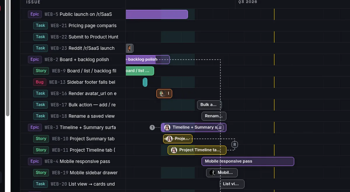
The arrows are elbow (right-angled) connectors, not straight diagonals, so they route cleanly between rows instead of cutting across bars. Each kind has its own treatment: Blocks uses the bug tone, Relates to uses the subtask tone and renders dashed, Duplicates uses the epic tone. An arrowhead marks the target end, and a small persistent badge sits at the arrow's midpoint labeled B, R, or D so you can read the relationship type without memorizing the color code. Hover an arrow and it thickens to yellow, your signal that it's live and editable.
A concrete case from WEB: the "API contract" ticket blocks the "Timeline + Summary tab" ticket, because you can't build the tab against a contract that isn't finalized. Drag from API contract's link handle to the Timeline + Summary row, choose Blocks, and the elbow arrow with its B badge makes that ordering visible to everyone looking at the plan.
There's a cycle guard built in. If you try to create a blocks link whose reverse already exists (A blocks B, and now you try B blocks A), it is rejected on the client and on the server, with a message that it would create a cycle. You can't tie the plan into a knot where two tasks each block the other. That check runs before anything saves, so you're told immediately rather than after the fact.
flowchart TD
  A[Drag from link handle] --> B[Drop on target row]
  B --> C{Pick kind}
  C -->|Blocks| D{Reverse blocks link exists}
  C -->|Relates to| E[Arrow saved]
  C -->|Duplicates| E
  D -->|no| E
  D -->|yes| F[Rejected as a cycle]
The same links are plain API resources, so an agent or a script can record an ordering the moment it discovers one. POST to the issue's links collection with the issues:write scope; direction: "out" means the anchor issue blocks the target:
curl -X POST "https://utter.ae/api/v1/workspaces/utter/projects/WEB/issues/WEB-8/links" \
  -H "Authorization: Bearer utp_live_a1b2..." \
  -H "Content-Type: application/json" \
  -d '{"kind": "blocks", "direction": "out", "target_key": "WEB-12"}'
const res = await fetch(
"https://utter.ae/api/v1/workspaces/utter/projects/WEB/issues/WEB-8/links",
{
method: "POST",
headers: {
Authorization: "Bearer utp_live_a1b2...",
"Content-Type": "application/json",
},
body: JSON.stringify({ kind: "blocks", direction: "out", target_key: "WEB-12" }),
},
);
const link = await res.json();import requests
r = requests.post(
"https://utter.ae/api/v1/workspaces/utter/projects/WEB/issues/WEB-8/links",
headers={"Authorization": "Bearer utp_live_a1b2..."},
json={"kind": "blocks", "direction": "out", "target_key": "WEB-12"},
)
r.raise_for_status()The server enforces the same rules the UI does: a duplicate link comes back as a conflict, and so does a reverse blocks link that would create a cycle. The arrow drawn by hand and the one created over the API are the same row in the same table.
Editing and removing a dependency
Drawing the arrow is half of it. You'll also want to change or remove links as the plan shifts.
Click (or right-click) an arrow, or its midpoint B/R/D badge, and a Change kind picker opens. From there you switch the relationship to a different kind, or choose Remove dependency to delete it. Same three kinds, same picker as when you created the link.
One honest note about switching kinds. Under the hood, changing a dependency's type is a delete-then-recreate, not a single in-place edit. You'll see a brief optimistic swap as the old link is removed and the new one drawn. In practice it feels instant, but if you're ever debugging why a link's history reads as a remove followed by an add, that's why. It isn't a bug; it's how the change is applied.
Removing a link is forgiving. When you choose Remove dependency, an inline "Dependency removed." bar appears with an Undo action. It hangs around for about six seconds and then dismisses itself, so a misclick is a one-tap recovery rather than a redraw-the-arrow chore. If you meant it, ignore the bar and it clears on its own.
Zoom, filters, and sprint bands
A plan that spans a quarter doesn't read well at the same density as a plan that spans two weeks, so the timeline gives you a zoom control in the top-left with three levels: Weeks, Months, Quarters. Each one changes the pixels-per-day density and the header columns. At the Quarters level the header reads "Q{q} {year}" (like "Q3 2026"), so you stay oriented to the right span of time whichever zoom you're in. Zoom out to see the whole roadmap shape; zoom in to line up work day by day.
The timeline respects the same filtering you already use on the Board. Type, priority, status, label, and assignee controls all apply here, and so do Saved Views, with the filter state living in the URL so a filtered timeline is a link you can share.
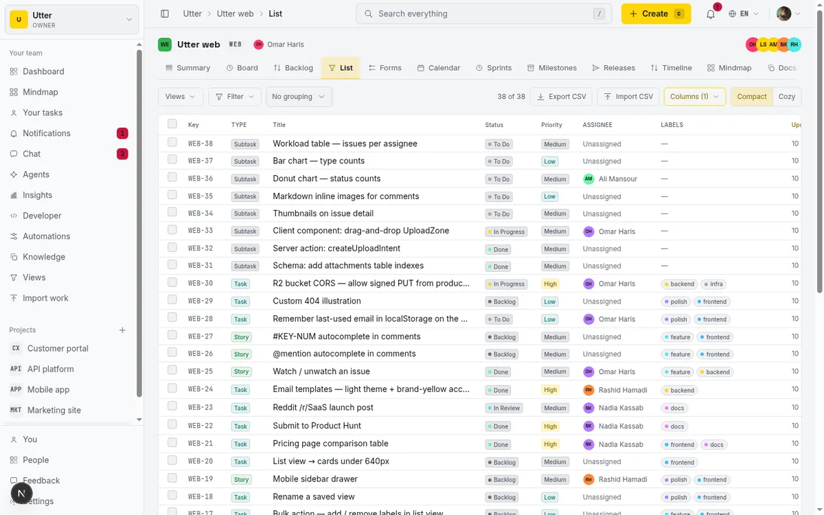
One nice touch: when a filter hides one end of a dependency, the arrow doesn't just vanish into nowhere. It collapses into a per-row "hidden dependencies" stub badge, so you still know a link exists even though its other end is filtered out of view. The plan never silently drops information; it tells you something's been tucked away.
Sprints show up too, as context rather than as bars you can drag. Active and planned sprints that have both a start and an end date render as subtle full-height background bands behind the rows, labeled with the sprint name. Active sprints read a little stronger, in cyan, so the sprint you're in now stands out from the ones coming up. Completed sprints don't appear at all; they're history, not plan. If you want the full story on how sprints work, that's its own topic, covered in running sprints without the ceremony.
Note that the zoom control is a desktop feature. It's hidden on small screens, for a reason that lands in the next section.
What the Gantt does not do
Every honest tool has edges, and knowing them keeps you from planning around something that isn't there.
No milestone markers on the canvas. Milestones exist in Utter as a data concept: an issue can be assigned a milestone on its detail page. But the timeline does not draw milestone diamonds, markers, or vertical lines. The only overlays behind the bars are sprint bands. If you're expecting a classic Gantt milestone diamond pinned to the today axis, it isn't here, and you shouldn't schedule a review around one appearing.
Dependencies are visual and relational, not scheduling constraints. This is the big one. The arrows record that A blocks B and draw the relationship, but they move nothing for you. Drag a bar that other tasks depend on and the dependent bars stay exactly where they are. There is no finish-to-start or start-to-start engine, no automatic cascade that pushes downstream work when upstream slips. The dependency tells you and your team about the ordering; rescheduling is still a human decision you make by dragging. If you slip the API contract, you decide whether the Timeline tab moves with it.
No column reordering. Rearranging columns is a Board feature. The timeline's rows are ordered by structure (epics, children, orphans), and you don't drag them around.
No jump-to-date control. The today marker and the auto-scroll to today are fixed behaviors. There's no date picker to leap the canvas to an arbitrary month; you scroll, and zoom out if you need to cover more ground faster.
Mobile is a different view entirely. Below the desktop breakpoint the Gantt is replaced by an agenda-style list split into Scheduled and Needs dates sections, each card offering Schedule or Edit. It's a genuinely useful way to read and adjust the plan on a phone, but drag-to-move and dependency-drawing are desktop-only. That's why the zoom control disappears on small screens: there's no canvas to zoom. Draw your dependencies at a desk.
How this fits the rest of your workflow
The timeline is one lens on a project, not the whole thing, and it's strongest when you use it for what it's actually good at: the time dimension and the relationships between work.
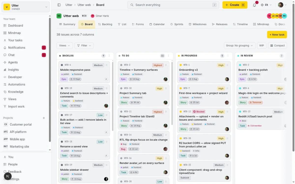
Day to day, your team lives on the kanban board, moving cards through columns as work flows. When you're deciding what comes next, that's the backlog and sprints. When you want to understand how the project is shaped, which epics contain what and how it all hangs together, the mind map shows structure. The timeline is where all of that meets a calendar. It answers "when," and "what's waiting on what," in a way none of the other views do.
If you've ever tried to force this out of a heavier tool, it's worth seeing how the two compare in Utter vs Jira. Short version: dates you already keep on your issues become a plan you can see and drag, with no separate planning module to learn.
Open the Timeline tab on a real project and drag one bar. That's the fastest way to feel what it does.
Frequently asked questions
Which issues show up as bars on the Gantt chart, and which don't?
Only issues with at least one date, a start date, a due date, or both, render as bars. An issue with no dates has nothing to position on the time axis, so it never draws a bar. Undated issues still appear as rows with a No dates pill and a + Schedule action, so you can place them on the plan, but until they carry a date they aren't part of the drawn Gantt.
How do I add a dependency between two tasks on the Gantt chart?
Hover the first task's bar, find the small round link handle just past its trailing (due) edge, and drag from it across to the other issue's row. When you drop, a Link as picker offers Blocks, Relates to, and Duplicates; pick one and the arrow appears. It's a pointer-only interaction, so you'll need a mouse or trackpad; to add a link with the keyboard, use the Linked Issues panel on the issue detail page instead.
What do the Blocks, Relates to, and Duplicates dependency types mean?
Those are the three kinds Utter supports. Blocks means one task must be resolved before the other can proceed (the ordering relationship, drawn in the bug tone). Relates to is a soft, non-blocking connection between related work (drawn dashed in the subtask tone). Duplicates marks that two issues describe the same work (drawn in the epic tone). Each arrow carries a midpoint badge, B, R, or D, so you can read the type at a glance.
Does dragging a bar automatically move the tasks that depend on it?
No. Dependencies in Utter are visual and relational, not scheduling constraints. There's no finish-to-start automation, so moving a bar does not push its dependent bars. The arrow records the ordering for you and your team, but rescheduling downstream work is a decision you make by dragging those bars yourself.
Can I create or edit dependencies using only the keyboard?
Not on the timeline itself. The link handle is pointer-only and hidden from assistive tech, so drawing an arrow needs a mouse. The keyboard-accessible path for dependencies is the Linked Issues panel on the issue detail page, and any link you create there shows up on the timeline. On the timeline, the keyboard handles dates: focus a bar, use Left/Right to move it a day, and Shift+Left/Right to resize the due edge.
Are there milestone markers on the timeline?
No. Milestones exist as a data concept (you can assign an issue a milestone on its detail page), but the timeline canvas does not draw milestone diamonds, markers, or lines. The only background overlays are sprint date bands.
Why can't I drag bars or draw dependencies (I only see a read-only Gantt)?
Dragging, resizing, scheduling, and drawing links are all gated by edit permission on the issue. Only an issue's reporter, its assignee, or someone with the issue.edit_any permission can change it. Without that, you still get a fully readable Gantt; it just doesn't respond to dragging. That's expected behavior, not a bug.
Does the Gantt chart work on mobile?
There's a mobile layout, but it isn't the drag-and-drop Gantt. Below the desktop breakpoint the canvas is replaced by an agenda-style list split into Scheduled and Needs dates sections, with Schedule and Edit actions on each card. It's good for reading and quick adjustments, but drag-to-move and dependency-drawing are desktop-only, which is also why the zoom control is hidden on small screens.
Related reading
Project calendar view
Open Utter's Calendar tab to see project due dates on a month or week grid, drag deadlines to reschedule, edit status inline, and filter by assignee.
July 15, 2026 · 13 min read
How to plan releases and milestones
Plan software releases and milestones in Utter: create releases and milestones, attach issues, read the progress meter, draft AI release notes, and set permissions.
July 15, 2026 · 14 min read
How to filter and sort issues
Filter issues by assignee, label, and status in Utter's list view, then sort, group, save a view, and share the exact filtered list as a URL.
July 15, 2026 · 16 min read
See your whole project as a mind map (and when it beats a nested list)
A nested list hides how work relates. A mind map shows it. When a map of your epics and stories helps, when a list is better, and how Utter's does it.
July 5, 2026 · 7 min read
How to organize work with epics and subtasks
Learn Utter's epics, stories, tasks, subtasks hierarchy: group work under an epic, break issues into subtasks, read the progress bar, and the rules it enforces.
July 15, 2026 · 17 min read
How to use a kanban board: a complete guide with a real example
Learn how to use a kanban board in Utter: read cards, drag tasks between columns, add and reorder custom columns, set WIP limits, filter, and save views.
July 15, 2026 · 20 min read
How to read the project summary
Read the Utter project Summary tab like a pro: what every card shows, how each number is computed, what good looks like, and where the dashboard stops.
July 15, 2026 · 16 min read
How to use the mindmap
How to use Utter's project mind map view: open the radial tree, read the pills, expand and filter branches, group by Hierarchy/Status/People, and export a PNG.
July 15, 2026 · 14 min read
Project reports and insights
Read Utter's project reports and dashboards: Summary KPIs, sprint burndown, cycle time, throughput, workload, and workspace Insights, with the honest limits on each.
July 15, 2026 · 16 min read
How to track time on issues
How to track time on issues in Utter: set estimates and spent hours, read the budget bar, set completion, and roll it all up on the project summary.
July 15, 2026 · 14 min read
أضف تعليقًا
ابدأ النقاش.