
Cycle time vs lead time (and how to actually measure both)
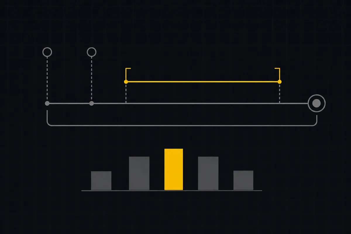
A team lead pulls up two dashboards and sees "cycle time: 4 days" on one and "lead time: 4 days" on the other, for the same project, in the same week. Someone asks which number to trust in standup, and nobody can answer, because nobody can say where each clock starts. That is the real problem hiding behind "cycle time vs lead time." Both terms are easy to define and easy to mix up, and most articles stop at the definition and leave you exactly where the standup left off.
This post goes past the definition: what each metric measures, why the gap between them is the interesting part, how a tool reconstructs both from your issue history (including the honest fallback for when the data is thin), and what to do with a p50, a p75, and a histogram once you have them.
The two clocks: what cycle time vs lead time actually measure
Cycle time vs lead time is, at its plainest, a question about where you put the "start" mark on the same finish line.
Lead time runs from when the work was requested, which in a tracker means when the issue was created and logged, to when it was marked done. It answers the question a stakeholder asks: "I filed this. How long until it shipped?"
Cycle time runs from when the work actually started, which on a board means the moment it moved into an In Progress column, to when it was marked done. It answers a narrower question the team asks itself: "Once we picked this up, how long did it take?"
The finish line is identical. The difference is entirely in the start, and the space between the two starts has a name: the time the item sat in the backlog waiting for someone to pull it, which is queue or wait time. Lead time includes that wait. Cycle time does not.
flowchart LR
    A[Created] -->|queue / wait time| B[Moved to In Progress]
    B -->|active + blocked + idle| C[Marked Done]
    A -.->|Lead time| C
    B -.->|Cycle time| C
One thing to nail down before anyone argues about it in a retro: both of these are elapsed wall-clock time, not active-work time. If an issue starts on a Thursday and finishes the next Wednesday, that is six days of cycle time, even if the actual keyboard work was four hours. Weekends count, nights count, a day spent blocked on someone else counts. Standard flow-metrics guidance (55degrees, on getting started with flow metrics) is explicit that this elapsed clock keeps running through blocked, idle, and weekend time, and that is the definition worth adopting because it is the one your customers experience. They do not feel your flow efficiency; they feel the wall clock.
Jira and Linear draw the same line, which helps when you are reconciling numbers across tools. In Jira's terms, cycle time is the time an issue spends in active development, typically from the status change into In Progress until complete, while lead time runs from when the work item is logged (created) until it is completed. Linear's Insights uses the same split: Cycle Time is "time from issue start to completion" and Lead Time is "time from issue creation to completion." The vocabulary is standard. The confusion in that opening standup is almost never about the definitions. It is about which start point a given dashboard silently chose.
Why the difference matters (and who should care about which)
Once the two clocks are separated, you can assign them to the people who actually need them, because they answer different questions for different audiences.
Cycle time is a delivery-health metric, the team's number. It tells you how predictable you are once work is genuinely underway, which is what you need for sprint forecasting and for tuning work-in-progress limits. If your cycle time is tight and stable, you can make commitments with a straight face. If it is jumping around, no amount of estimation ceremony will fix your planning, because the variance is downstream of the estimate.
Lead time is a stakeholder metric, the customer's number. It includes the backlog wait, so it tells the person who filed the request how long they will actually wait end to end. That is the number to quote when someone asks "when will this be done," because it is honest about the queue in front of their request.
The most useful move is to watch the two together, because the gap between them is a diagnostic. If lead time keeps climbing while cycle time stays flat, your team is not getting slower at execution. Your backlog is aging. Work is sitting longer before anyone pulls it, which is a prioritization and capacity problem, not a delivery one. Chasing that with "the team needs to move faster" aims at the wrong target. The fix lives in how you prioritize your backlog and how much you commit to per sprint, not in the standup. Use cycle time to tune the machine, lead time to set expectations, and the distance between them to tell whether your problem is execution or queueing.
How to measure cycle time and lead time from real data
Here is the part most posts skip, and it is the part that actually bites. You cannot compute cycle time from a spreadsheet of created dates and closed dates. It is not there.
Lead time needs two timestamps that live on the issue row: when it was created, and when it was resolved. A plain export of created and closed dates is enough, so lead time is, in that sense, free. Cycle time needs something the row does not carry: the moment work started. "Moved into In Progress" is an event that happened partway through the issue's life. It is not a column on the issue; it is a line in the issue's history. To know it, you need an append-only activity log that recorded the transition, specifically the first time the status changed to the In Progress category. Without that log, the start of the cycle is unknown, and no clever query recovers it, because the information was never written down.
That asymmetry explains a lot of real-world confusion. Lead time is easy, so tools show it everywhere. Cycle time is earned, because it depends on your history being recorded and on your team actually moving cards into In Progress when they start. When a "cycle time" number looks suspiciously like a lead time number, the usual reason is that the tool could not find real In Progress transitions and quietly fell back to the created date, which is exactly the trap in this post's opening. So the honest question for any cycle-time report is not "what is the number" but "where did the start come from."
How Utter computes both from your issue history
Here is the concrete version, from the actual implementation. Utter computes cycle time from an issue's first transition into In Progress (the earliest status_changed event in the append-only activity log whose target is the In Progress category) to resolvedAt, the moment it reached the done category. Lead time uses the simpler pair, created_at to resolvedAt.
A few rules shape the sample, and they are all deliberate:
- Only Done issues, inside a window. It counts issues that reached done with a
resolvedAtinside a selectable window of 7, 30, or 90 days, defaulting to 30. A recent-throughput view, not an all-time export. - Cancelled and failed work is excluded. The code is blunt about why: "Cancelled work is excluded: it never completed, so it is not a cycle."
- Elapsed wall-clock, nothing subtracted. The duration includes blocked, idle, and weekend time between the In Progress transition and done. Utter does not subtract paused or blocked spans, which matches the standard flow-metric definition and is the number your stakeholders feel.
- Capped at 5,000 most-recent resolved issues. For performance, the sample is bounded to the most recently resolved issues in the window; the median, p75, and buckets across that set are treated as representative, keeping the query fast on projects with a long history.
Custom board columns do not break this. Under the hood, the fixed status category (backlog, todo, in_progress, done, and so on) is the semantic backbone, and your named columns each map to one category. So any custom column mapped to the In Progress category counts as the start, and any column mapped to done sets resolvedAt. You can rename "In Progress" to "Building" and split it into three columns; as long as they point at the In Progress category, the cycle clock still starts at the first one your issue enters.
The honest fallback: when there is no In Progress to measure
This is the part that separates a trustworthy report from a misleading one, and it is where Utter refuses to fake a number.
Plenty of teams do not move cards through In Progress; they drag straight from Todo to Done, because the work was tiny or because that is the habit. For those teams the activity log has no In Progress transition to find, and a naive tool would either error out or, worse, silently use the created date and label the result "cycle time" anyway. That is the exact lie behind the opening standup.
Utter handles it by checking the data before it commits to a basis. If fewer than half the resolved sample has a recorded In Progress event, the report flips its entire basis from In Progress to created, measuring creation-to-done for the whole card, which is lead time. Then it says, in plain text on the card, which basis is active:
- "Measured from first move into In Progress to Done." when the basis is In Progress.
- "Measured from issue creation to Done (lead time)." when it fell back to created.
State the limit plainly: cycle time only exists when issues actually pass through an In Progress status. Skip that state and there is no cycle to measure, so you get lead time only, and Utter says so rather than dressing a lead time up as a cycle time. A number you cannot trace to a real start is worse than no number, because it walks into standup looking confident. Both "our cycle time is 4 days" and "we are actually looking at lead time" are fine answers, but only one is true for your team, and the tool will not guess wrong on your behalf.
Reading the numbers: median, p75, and the histogram
Say the report found real In Progress transitions and you are looking at genuine cycle time. Now what? Not the average.
Averages lie about cycle time, and it is not a close call. One issue that sat blocked for 40 days drags the mean of an otherwise-tight distribution somewhere unrecognizable. The 55degrees guidance is explicit: do not average cycle times, because a single large delay skews the mean, and read percentiles instead. Utter does not show a mean at all. It reports two percentiles and a shape:
- p50, the median (labeled "Median"). The typical case. Half your finished work took this long or less. The honest "usually" number.
- p75 (labeled "p75"). Three quarters of your work came in at or under this. Your commitment number, the one to lean on when you tell someone "most of the time it is done within N days."
Both use true linear interpolation between the sorted samples, not a nearest-rank shortcut, so a p75 on a sample of 9 lands between the real values rather than snapping to the closest row.
Then there is the histogram, where the real reading happens. Utter buckets every finished issue into five fixed buckets and calls out where the median falls: under 1 day, 1 to 3 days, 3 to 7 days, 1 to 2 weeks, and an open-ended 2 weeks plus. A tight cluster in one or two buckets means you are predictable and can plan against it. A long tail into "2w+" means something is inconsistent, and that tail is worth investigating (usually a class of work that keeps getting blocked, or a review step that stalls).
Be clear about what this view does not give you, because it is deliberately narrow. Utter reports p50 and p75, and that is the whole percentile menu; practitioners who prefer the 85th or 95th percentile for planning will not find them here. There is no scatterplot, and no per-stage breakdown of how much of the cycle was pickup versus coding versus review. It is a median, a p75, and a five-bucket histogram. That is a deliberate ceiling, not an oversight, and whether it is enough depends on how much rigor your planning needs.
How Utter, Jira, and Linear compare on flow metrics
If you are weighing tools, here is the honest, factual version, all as of July 2026. The three take genuinely different approaches, and two of them do things Utter deliberately does not.
Jira gives you two separate things. Its Control Chart shows cycle time (or lead time, it is configurable) for a product, version, or sprint by taking the time an item spent in a status or set of statuses over a period, plotting the average, a rolling average, and the standard deviation. Separately, a newer cycle time report defines cycle time as the time from a work item's first commit until the code is shipped, shown as a scatterplot of items shipped per week with a weekly median trend line. That newer report is code-centric and has a real dependency: it needs deployment events from a connected CI/CD tool (Bitbucket, GitHub, GitLab, Jenkins, or CircleCI) plus commit events, and it captures only the most recent deployment. It measures something closer to engineering delivery than board flow, and only works if your pipeline is wired in.
Linear Insights measures Cycle Time as time from issue start to completion (only plotting issues that spent time in progress before completion) and Lead Time as time from issue creation to completion. Both are scatterplots, with hover markers for the 25th, 50th, 75th, and 95th percentiles. That is a richer visual than Utter's histogram and a fuller percentile spread. The catch is availability: Linear Insights is on the Business and Enterprise plans only, not Free. Linear's pricing is Free at $0, Basic at $10 per user per month billed yearly, and Business at $16 per user per month billed yearly, with Enterprise custom; Insights first appears at the Business tier.
Utter reports a median, a p75, and a five-bucket histogram, with the honest basis fallback above, on every plan including Free, because reporting is a base feature. Its pricing is Free at $0, Pro at $3 per editor seat per month, and Business at $6 per editor seat per month, with viewers free and agent members never counting as billed seats.
| Flow metrics, as of July 2026 | Utter | Jira | Linear |
|---|---|---|---|
| Cycle time | Median + p75, In Progress to Done | Control Chart (time in status) + newer report: first commit to shipped | Scatterplot, issue start to completion |
| Lead time | Created to Done, incl. honest fallback | Control Chart, configurable to lead time | Scatterplot, creation to completion |
| Percentiles shown | p50, p75 | Average, rolling average, std dev | 25 / 50 / 75 / 95 |
| Visual | Five-bucket histogram | Control Chart / scatterplot | Scatterplot |
| CI/CD-based cycle time | No | Yes (needs connected pipeline) | No |
| Flow metrics on free plan | Yes (reporting is a base feature) | Free tier exists; per-plan details not covered here | No (Insights is Business+) |
| Entry price | $0 Free, $3/$6 per editor seat | Free tier available | $0 Free, $10 Basic, $16 Business (yearly) |
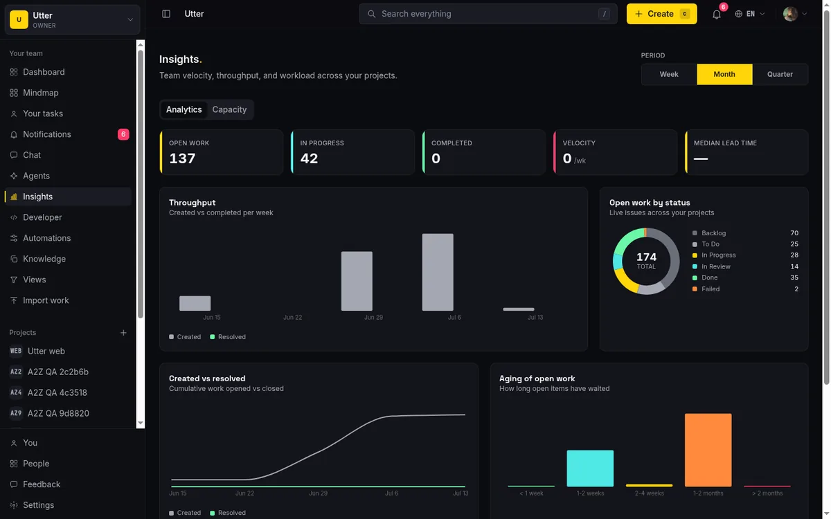
The generous read: Jira's CI/CD-correlated cycle time and Linear's percentile scatterplots do real things Utter does not attempt. If you want to correlate cycle time with deploys, Jira's newer report is built for that; if you want a 95th-percentile scatterplot, Linear gives you one. Utter's angle is narrower on purpose: a calm median-and-histogram on every plan including Free, with a report that tells you when it is actually showing lead time. It is not a configurable report builder, and does not pretend to be. The reports and insights walkthrough covers the rest of the surface, and the project summary guide covers the KPI strip where the cycle-time number also appears (labeled "Median lead time" there, since that surface leads with the end-to-end figure).
Fixing your data so cycle time becomes real
If your report fell back to lead time, do not go looking for a setting to flip. There isn't one, and that is intentional. The fix is workflow hygiene, and it is small.
Move cards into In Progress when work actually starts. That is the whole thing. The report fell back because fewer than half your finished issues ever recorded an In Progress transition, which happens when people drag straight from Todo to Done. Break that habit and the transitions start landing in the activity log on their own. Two things make it stick: keep an In Progress column mapped to the In Progress category, so there is somewhere for work to land, and let the activity log accumulate real transitions as your team works normally, since every status change is recorded automatically.
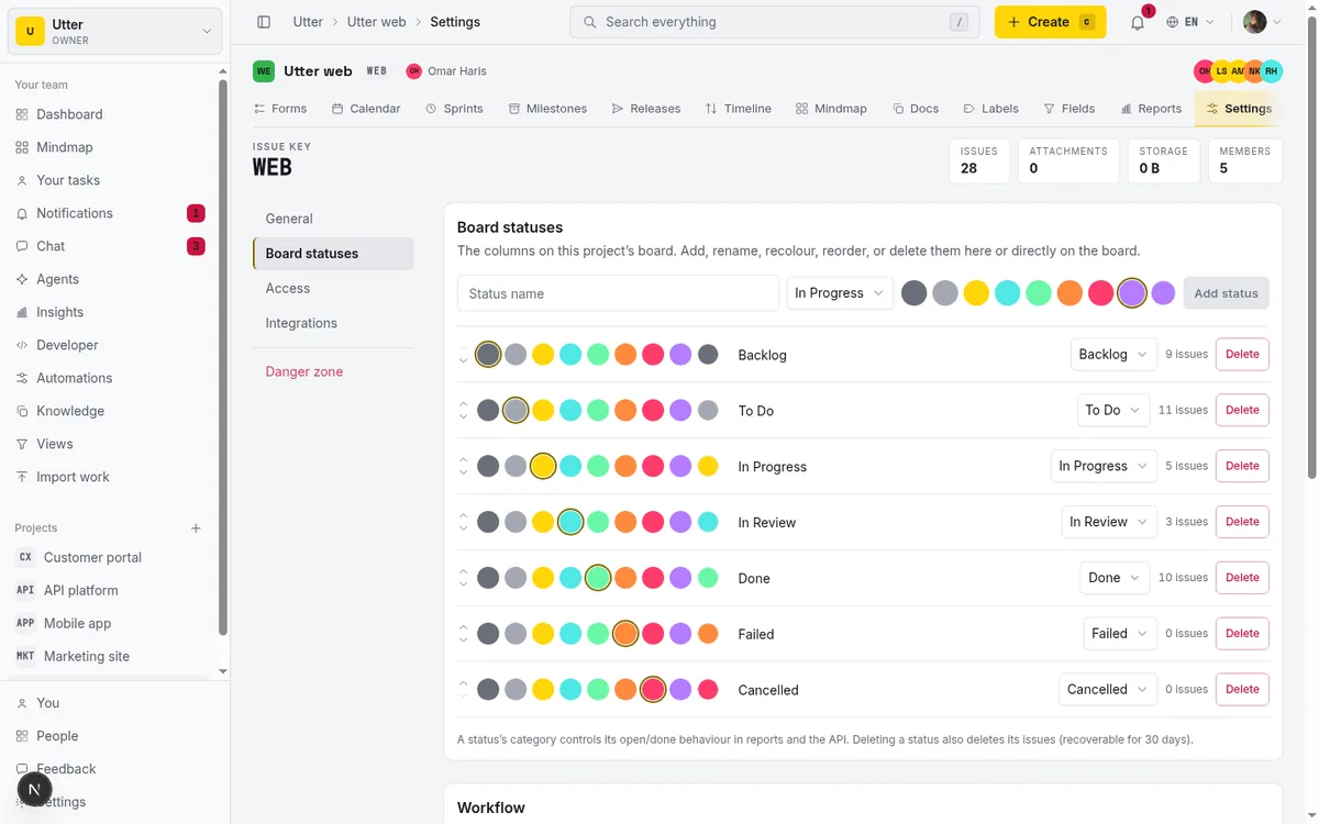
The board statuses tab above is where you confirm the mapping. Each named column shows which category it belongs to, so you can check that your "In Progress" (whatever you call it) points at the In Progress category and not, say, Todo.
One encouraging note: this is retroactive-ish. You cannot invent transitions for issues that already skipped In Progress, but once real transitions start landing, the next window's report has enough of them to compute genuine cycle time, and the card flips its basis back from created to In Progress on its own. It ends up measuring what your team actually does, which is the only version worth trusting in standup.
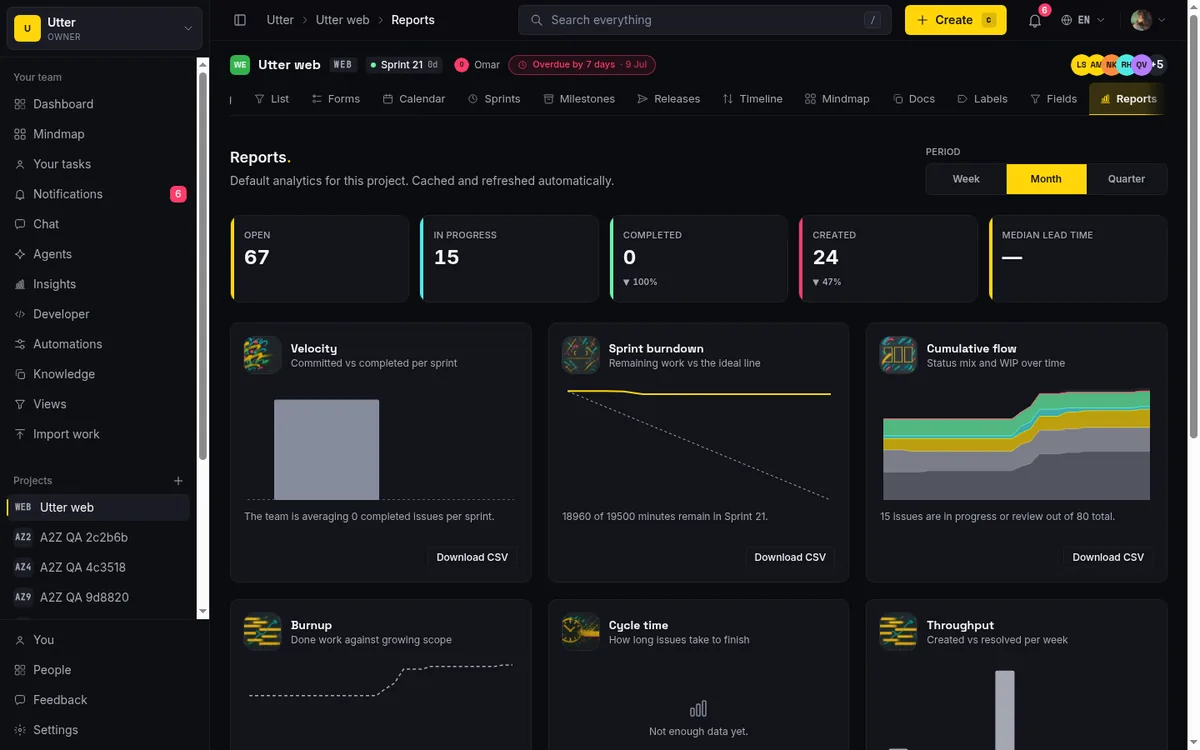
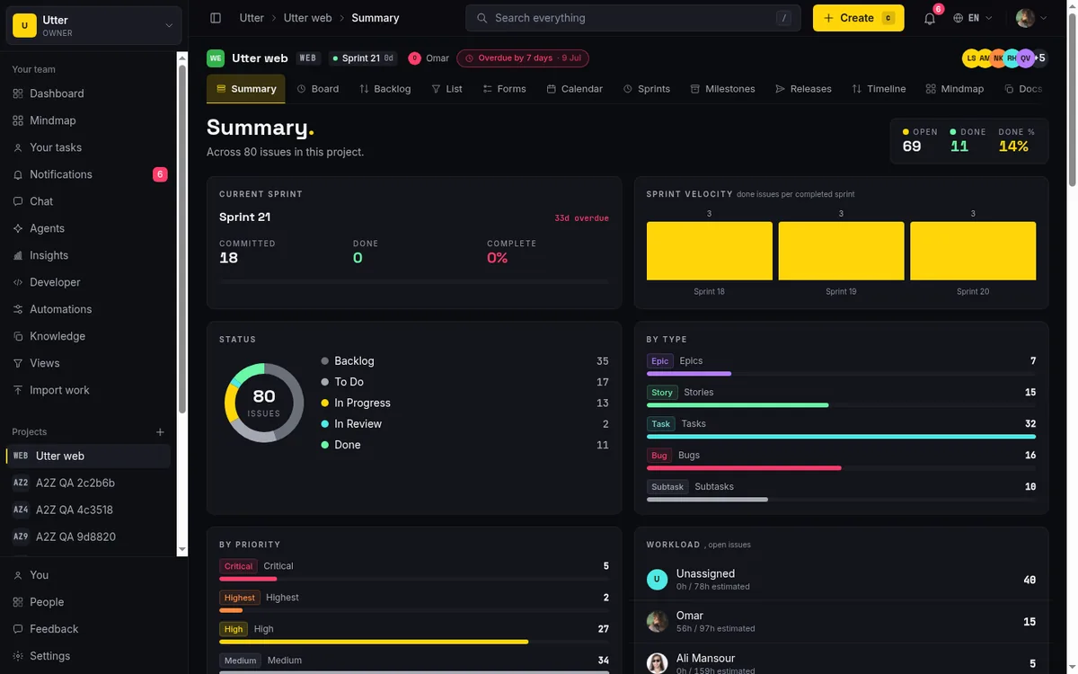
If you want to see where both clocks already live in your own project, open the Reports page and the summary in any Utter workspace and check which basis your cycle-time card is on.
Frequently asked questions
What is the difference between cycle time and lead time?
They share a finish line and differ only in the start. Lead time runs from when the issue was created (requested) to done. Cycle time runs from when work actually started, the first move into In Progress, to done. The gap between them is the time the item waited in the backlog. Both are elapsed wall-clock time, not active-work time.
Is cycle time or lead time better for measuring team performance?
Cycle time, for delivery predictability, because it measures how long work takes once the team starts it (useful for sprint forecasting and WIP tuning). Lead time is better for stakeholder expectations, since it includes the backlog wait. Watching both is most useful: a widening gap means backlog aging, not slow execution.
How do you measure cycle time from issue data?
You need the issue's status-change history, not just created and closed dates. Cycle time depends on the first transition into In Progress, which lives in an append-only activity log, not on the issue row. Lead time only needs the created and done timestamps, which is why it is easy and cycle time has to be earned.
Why does my cycle time report show lead time instead?
Because too few of your finished issues had a recorded In Progress transition. In Utter, if fewer than half the resolved sample passed through In Progress, the report flips its basis to created, measures creation-to-done (lead time) for the whole card, and labels which basis is active. The usual cause is dragging cards straight from Todo to Done. Start moving work into In Progress and the next window computes real cycle time.
Does cycle time include weekends, blocked, and idle time?
Yes. Cycle time is elapsed wall-clock time, including weekends, nights, blocked spans, and idle time between the In Progress transition and done. Utter does not subtract paused or blocked periods, matching standard flow-metrics definitions. It is not active-work time or flow efficiency.
What percentiles should I use for cycle time, p50 or p95?
Use the median (p50) for the typical case and p75 for "most of the time" commitments. Averages are a poor fit because one long outlier skews the mean. Some practitioners prefer the 85th or 95th for planning; Utter reports p50 and p75 only, so if you need the 95th you would reach for a tool that plots it.
Can I see cycle time and lead time on Utter's free plan?
Yes. Reporting is a base feature on every plan including Free, with no upgrade gate. The cycle-time card, the p50 and p75 figures, and the histogram all appear on Free. Utter's pricing as of July 2026 is Free at $0, Pro at $3 per editor seat per month, and Business at $6 per editor seat per month, with viewers and agents free.
How is Utter's cycle time different from Jira's or Linear's?
As of July 2026, Utter reports a median, a p75, and a five-bucket histogram on every plan, and flips honestly to lead time when In Progress transitions are missing. Jira offers a Control Chart plus a newer report that measures first commit to shipped and needs CI/CD deployment events. Linear plots cycle and lead time as scatterplots with 25/50/75/95 markers, but only on Business and Enterprise. Jira's CI/CD-correlated report and Linear's scatterplots do things Utter deliberately does not; Utter's trade is calm defaults on Free over a configurable report builder.
Related reading
Scrum vs kanban: choose per project, not per religion
Scrum vs kanban: choose the methodology per project, not per team religion. The one mechanic that actually differs, when each fits, an honest Utter vs Jira/Linear/Trello price and feature comparison (as of July 2026), and how to switch a project between the two with zero migration.
July 16, 2026 · 11 min read
Story points or hours, and parallel sprints when squads share a project
Utter now estimates in story points or hours per project (Fibonacci scale, points-based velocity) and runs parallel sprints when squads share a project. Both opt-in, on every plan.
July 17, 2026 · 7 min read
How to track time on issues
How to track time on issues in Utter: set estimates and spent hours, read the budget bar, set completion, and roll it all up on the project summary.
July 15, 2026 · 14 min read
How to plan releases and milestones
Plan software releases and milestones in Utter: create releases and milestones, attach issues, read the progress meter, draft AI release notes, and set permissions.
July 15, 2026 · 14 min read
How to read the project summary
Read the Utter project Summary tab like a pro: what every card shows, how each number is computed, what good looks like, and where the dashboard stops.
July 15, 2026 · 16 min read
Monday.com alternatives built for software teams, not marketing ops
Monday.com alternatives for software teams: real pricing (3-seat minimum vs $3/$6 per builder seat), category-backed statuses, sprints with carryover, and agents as free members not billed integrations.
July 16, 2026 · 12 min read
Project reports and insights
Read Utter's project reports and dashboards: Summary KPIs, sprint burndown, cycle time, throughput, workload, and workspace Insights, with the honest limits on each.
July 15, 2026 · 16 min read
Project calendar view
Open Utter's Calendar tab to see project due dates on a month or week grid, drag deadlines to reschedule, edit status inline, and filter by assignee.
July 15, 2026 · 13 min read
How to run a sprint
Learn how to run a sprint in Utter: plan from the backlog, start and complete a sprint, carry over incomplete issues, and read the burndown and velocity.
July 15, 2026 · 13 min read
How to run sprints without drowning in ceremony
A lightweight sprint process for small teams: what to keep, what to cut, and how to get the value of planning and review without the meeting tax.
July 12, 2026 · 5 min read
أضف تعليقًا
ابدأ النقاش.