
How to read the project summary
You open project WEB on a Monday. Standup is in ten minutes, or your lead pings you with the question every project attracts sooner or later: "how's it going?" You could open the board and start counting cards. You could scroll the backlog and do the math in your head. Or you could open the one tab that already did the counting for you.
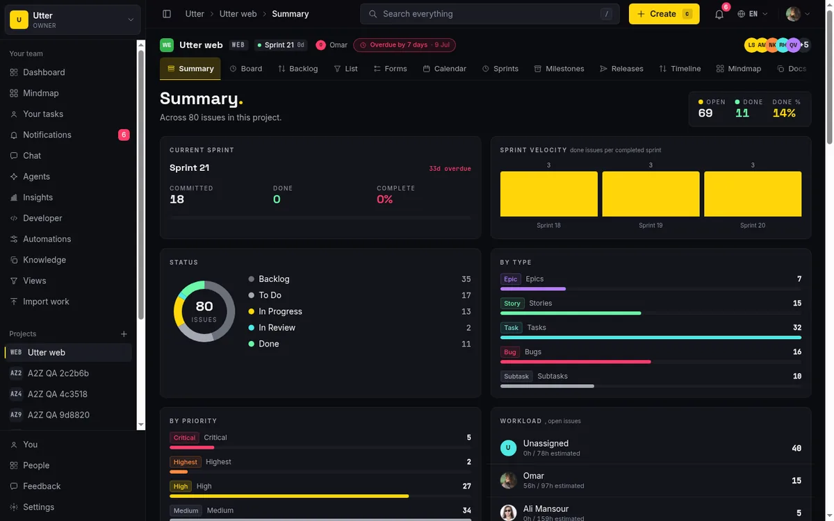
That tab is Summary. This is a guide to reading it well. If what you want is a project dashboard overview at a glance, the Summary tab is the screen built for exactly that: one page, computed live, that tells you how much work is open, how much is done, who is carrying it, and what is about to blow a deadline. No clicking through twenty tickets. No mental arithmetic.
I will walk the whole page top to bottom, card by card. For each one I will tell you what it shows, how the number is actually computed (a metric you do not understand is a metric you will misread), and what "good" looks like when you glance at it. I will also be honest about where this page stops, because Summary and Reports are two different tools and reaching for the wrong one wastes your afternoon.
Throughout, I use a demo project called WEB with the columns Backlog, To Do, In Progress, In Review, and Done. Real tickets, real numbers.
What the project summary tab actually is
Open any project and you land here. The project root URL, /w/[ws]/p/[project], redirects straight to /summary, and Summary is the first tab in the project's tab strip. That is deliberate. When you walk into a project cold, the first thing you should see is its state, not its board.
So think of Summary as a project dashboard overview at a glance: a fixed, read-only snapshot of one project, assembled fresh every time you load it. Every number is computed live in SQL, scoped to this one project in this one workspace. Nothing here is cached from yesterday, and nothing here belongs to another team. When you load WEB's summary, you are looking at WEB's issues, counted right now. The queries fan out concurrently, so even a project with tens of thousands of issues loads without you waiting on it.
Each card on the page answers one question. Here is the map we are about to walk:
| Card | The question it answers |
|---|---|
| Header trio (Open / Done / Done %) | How much is done? |
| Status donut | Where does the work sit? |
| By type / By priority | What kind of work is queued? |
| Workload | Who is carrying it? |
| Velocity / Recently completed | How fast is it moving? |
| Sprint burndown / Cycle time | Are we on pace, and how long does work take? |
| At risk / Overdue | What is about to hurt? |
| Time / Recent activity | How is the budget, and what just happened? |
The important word is read-only. You come here to read state, not to change it. There are no drag handles, no inline editors, no "mark as done" buttons. Every clickable thing on the page is a link that takes you somewhere else (an issue, the board, the list view) to actually do the work. That constraint is a feature. A dashboard you can accidentally edit is a dashboard you stop trusting.
One more framing point before we start reading. The whole page counts only live issues. Anything soft-deleted or archived is excluded, everywhere, on every card. So when a number looks lower than you expected, the first question is "did someone archive a chunk of this?" and not "is the page broken?"
Reading the header trio: open vs done issue counts
Top right of the page, three numbers sit together: Open, Done, and Done %. This is the fastest read on the page, and most days it is the only one you need before standup.
Here is the exact math, because it matters:
// The header trio, exactly as the page computes it
const open = total - done - cancelled;
const donePct = total > 0 ? Math.round((done / total) * 100) : 0;
So on a WEB project with 80 live issues, 30 done and 5 cancelled:
| Live issues | Done | Cancelled | Open reads | Done % reads |
|---|---|---|---|---|
| 80 | 30 | 5 | 45 | 38% |
One subtlety worth knowing. Open is total minus done minus cancelled, and it does not separately subtract "failed." The failed status exists in the system, but the header folds it into the Open bucket. Most projects never touch failed, so this rarely bites, but if yours does, know that failed work counts as Open here.
The two small colored dots are not decoration. The dot on Open uses the in-progress tone and the dot on Done uses the done tone, so they visually rhyme with the status donut right below. Once your eye learns the colors in one place, they carry across the whole page.
Under the trio runs a one-line subtitle: "Across {n} issues in this project," where n is the count of live issues. That is your scope statement. It tells you how big the denominator is, so a Done % of 38% reads very differently across 80 issues than across 8.
What good looks like: a Done % that climbs week over week, and an Open number you recognize. If Open jumped from 45 to 90 since Friday and nobody planned a scope increase, that is your first thing to chase.
The status donut: a project health overview at a glance
Below the trio is the status donut, and this is the single best "how healthy is this" glance on the page. It is a ring chart with the total issue count sitting in the middle of the ring. Beside it, a legend lists each status that has at least one issue: Backlog, To do, In progress, In review, Done, Cancelled, each with its colored dot and its count.
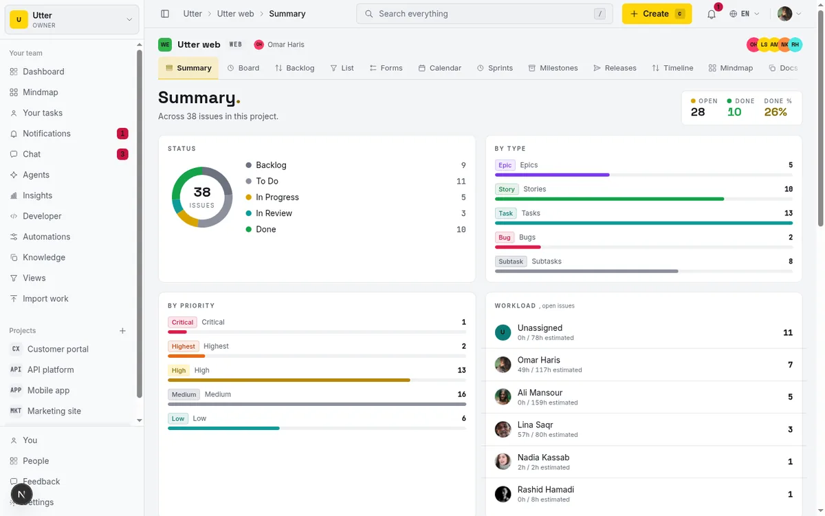
Only statuses with a count above zero get drawn. If WEB has nothing in Cancelled, Cancelled will not appear in the legend at all. That keeps the chart honest and uncluttered. You see the shape of the work, not a row of zeros.
Now, how to actually read it. The donut is about proportion, not just totals. The shapes to watch:
- A fat Backlog slice next to a thin In progress slice describes a project that has been planned but not started: plenty queued, nobody moving.
- Flip those proportions and you get the opposite story, everything in flight. If In progress is very fat, the team started more than it can finish.
- On WEB, if In review is bulging, that is a review bottleneck. Work is done but stuck waiting on someone to look at it.
Like everything else here, the donut counts only live issues, so archived and deleted work never inflates it.
One honest note. The failed status exists in the underlying data model, but it is not part of the ordered set the donut legend shows. The legend walks a fixed order (Backlog, To do, In progress, In review, Done, Cancelled) and stops there. So if you rely on failed as a real column, the donut will not surface it. Keep that limit in your back pocket.
By type and by priority: what kind of work is queued
Two cards sit side by side to break the work down a different way: not by where it is, but by what it is.
The By type card draws one horizontal bar per issue type that has issues: Epics, Stories, Tasks, Bugs, Subtasks. Each row shows the type's badge, its count, and a bar whose length is scaled to the largest type count. The biggest type fills the bar, and everything else reads as a fraction of it. The By priority card is the same layout for Critical, Highest, High, Medium, Low, and Lowest.
Read these together and they answer "what kind of work is queued." A WEB project that is mostly Bugs with few Stories is a project in firefighting mode. You are fixing more than you are building. Fine for a week; a problem for a quarter. Flip it, and mostly Stories with a thin Bug bar is healthy forward motion.
Priority does the same job from the risk side. A stack of Critical and Highest bars means too much is marked urgent for anyone to treat any of it as urgent. When everything is a priority, nothing is. If WEB shows twelve Highest-priority items, the honest read is that someone needs to sit down and re-rank, and that is a backlog exercise, not a summary one. When you are ready to fix it, the backlog prioritization guide covers the actual moves.
The workload card: who is carrying the project
The Workload card answers "who is loaded." Its subtitle, ", open issues," is the key to reading it correctly: these are counts of open work, per person.
Each row is one assignee, plus an Unassigned bucket, showing the avatar, name, and open-issue count. When issues carry estimates, the row also shows "{spent}h / {estimate}h estimated," so you see not just how many tickets someone holds but how much time they represent. Rows sort by open count descending, so the most-loaded person is always at the top.
The card counts only open (non-terminal) issues. Done and cancelled work never inflates anyone's number. That is the right call. A workload chart that included finished work would make your fastest closer look like your most overloaded person, which is backwards.
Two shapes to watch for:
- A big Unassigned bucket is a planning smell. Work exists but nobody owns it, and unowned work does not move. On WEB, if Unassigned is the top row, that is your standup topic.
- One person sitting at three times everyone else's count is a bottleneck. It usually means either a knowledge silo (only they can do this work) or a rebalancing that never happened.
When there is genuinely nothing open per person, the card shows a calm empty state: "Everyone's caught up." Believe it. That is a good day.
Velocity and recently completed: reading throughput
Now we move from "what is the state" to "how fast is it moving." Two cards, side by side.
The Velocity card (subtitle ", issues completed per week") is a six-column bar chart: issues that reached done, per calendar week, over the last six weeks. Weeks are aligned to Monday, the x-axis labels each bar by its week-start date (like "May 3"), and each bar carries its own count on top.
Read this one carefully, because the word velocity carries baggage from other tools. Here it means one specific thing: the count of issues that reached done, per calendar week, counted by when they were resolved. Not story points. Not per sprint. A raw weekly count of things that got finished. If WEB closed 4, 6, 3, 7, 5, and 6 issues over the last six Mondays, that is a steady team with normal week-to-week wobble. A cliff, say 6, 6, 6, then 1, 1, is the signal. Something stalled three weeks ago, and now you go find out what.
Right beside it, the Recently completed card (subtitle "last 6 closed") lists the six most recently resolved done issues, newest first. Each row has a done-tone dot, the type badge, the KEY-NUM and title as a deep link, and a relative timestamp (just now, then minutes, hours, days, then a date once it is old enough). So if the velocity bars tell you six issues closed this week, this card tells you which six. Click any of them, "WEB-142 Timeline + Summary tab," say, and you jump straight into that issue.
If nothing is closed yet, the card reads "Nothing completed yet." No drama, just the truth for a young project.
Sprint burndown and cycle time: the two analytical cards
These two are the most analytical cards on the page, and they reward a slower read.
Sprint burndown only appears when a sprint exists. When it does, you get two KPI tiles, Committed and Remaining, plus a line chart with three lines: a dashed Ideal reference line (the straight path from committed to zero), the solid actual-remaining line (what really happened), and a dashed flat projection from your last actual data point out to the sprint end date.
Which sprint does the card chart? It follows a fixed fallback:
flowchart TD
    A[Burndown card loads] --> B{Active sprint exists?}
    B -- yes --> C[Chart the active sprint]
    B -- no --> D{Any completed sprint?}
    D -- yes --> E[Chart the most recent completed sprint]
    D -- no --> F[Empty state: start a sprint]
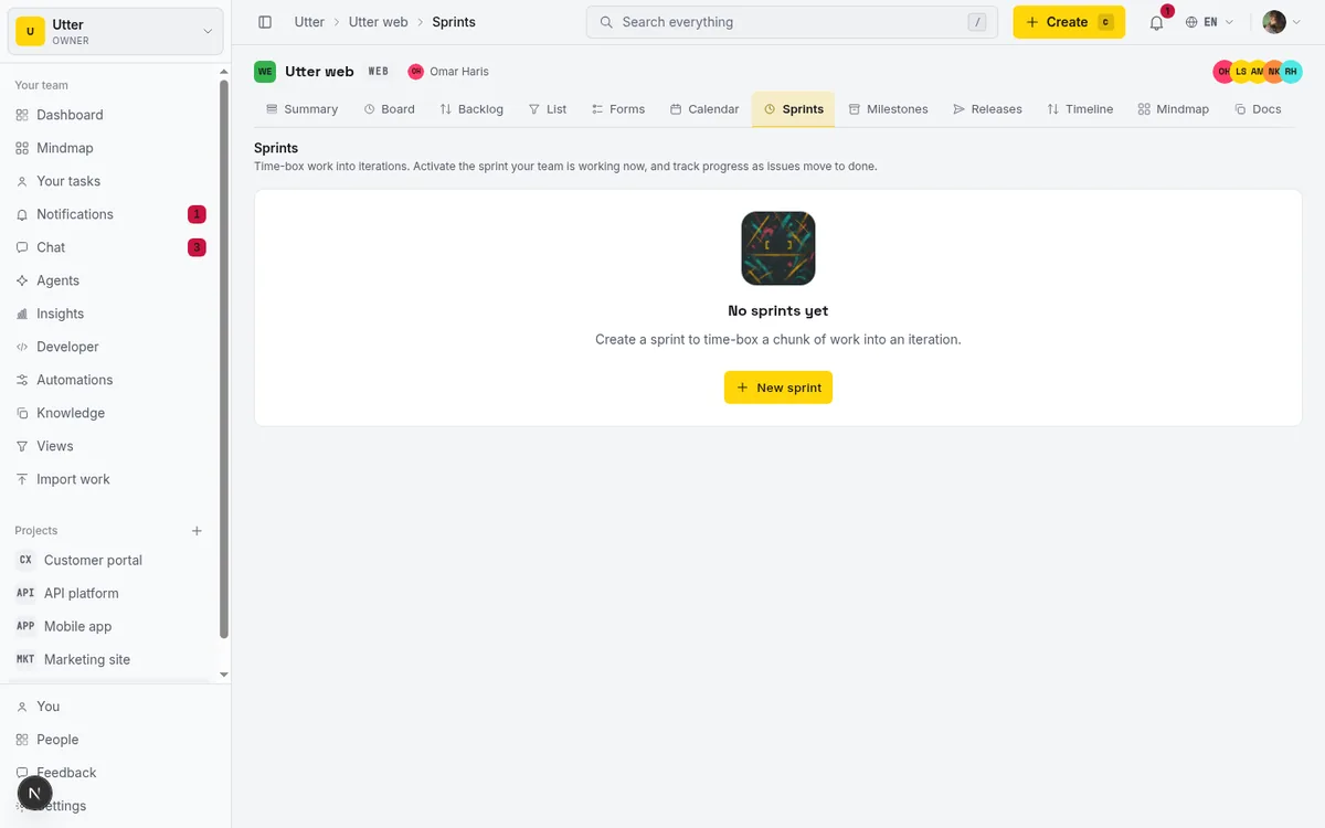
A planned-only sprint (one you set up but never started) is skipped on purpose; its dates are in the future and a burndown of it would be fiction. And with fewer than two days of data or zero committed work, the card will not draw a line. Instead you get a low-data note: "Start a sprint to see a burndown." or "Not enough days in this sprint to chart a burndown yet." That is not a bug. A burndown needs a start and a little history before it means anything.
Reading a burndown is pattern recognition. If the solid line hugs the dashed ideal, you are on pace. If the solid line sits stubbornly above the ideal and the projection runs flat past the sprint end, you are not going to finish what you committed, and the chart tells you that days before the deadline does.
The Cycle time card (subtitle "last N days," default 30) answers "how long does work actually take once we start it." You get three KPIs, Median, p75, and Sample, and a histogram bucketed into <1d, 1-3d, 3-7d, 1-2w, and 2w+. The footnote states the basis it used: "Measured from first move into In Progress to Done." when that data exists, or "Measured from issue creation to Done (lead time)." as a fallback when no In Progress transition was ever logged.
Median is your typical issue. p75 is your "three out of four finish within this" number, and it is the one that catches the long tail. If WEB's median is 2 days but p75 is 11, most work is quick but a quarter of it drags, and that drag is where your process pain lives. The histogram shows the shape: a fat 2w+ bucket means some issues sit forever, worth finding out which and why.
Two limits. Cycle time looks at the last 30 days by default and is capped at the 5000 most-recent resolved issues, and cancelled work is excluded from the whole calculation. When there is nothing to measure, you get "No completed work yet. Close a few issues to see cycle time." If you want to set up the sprints these cards feed on, the run-a-sprint guide walks it end to end.
At risk, overdue, and the current sprint cards
This is the card you scan when the question is not "how is it going" but "what is about to hurt."
The At risk / Overdue card leads with two header tallies: "{n} overdue" in pink and "{n} due soon" in yellow. Below them runs a list of open issues that are either overdue or due within three days, sorted soonest deadline first. Each row deep-links to the issue and carries a colored due label: due today, due tomorrow, in Nd, or "2d overdue" for the ones that already slipped.
Read the header first, the list second. The tallies are your gut check ("we have four overdue and six due soon"), and the list tells you exactly which ones so you can act. On WEB, if "WEB-98 Ship the pricing page" reads "1d overdue" at the top of the list, that is where your attention goes right now.
One implementation detail that matters for trust: the list shows at most 100 rows, but the header tallies are counted separately in SQL. So even on a project with 300 overdue issues (which would be its own emergency), the header count stays accurate while the list itself caps at 100. The number you glance at is always the real number. When there is genuinely nothing to worry about, you get "Nothing overdue or due soon. Nicely on track."
Two more cards live in this area, but only if your project uses sprints (an active sprint, or at least one completed one). The Current sprint card shows Committed, Done, and Complete% with a days-left or overdue badge and a progress bar; click the sprint name to open the board. The Sprint velocity card shows done-issues-per-completed-sprint bars for the last six sprints, labeled by sprint name.
Here is the distinction to nail down, because it trips people up. Sprint velocity is not the weekly Velocity card from earlier. The Velocity card counts issues per calendar week. Sprint velocity counts done issues per completed sprint. Same word, different denominator. If your sprints run two weeks long, the two charts will never match, and that is correct. They measure different windows on purpose.
The time card and the recent activity feed
Two cards round out the page.
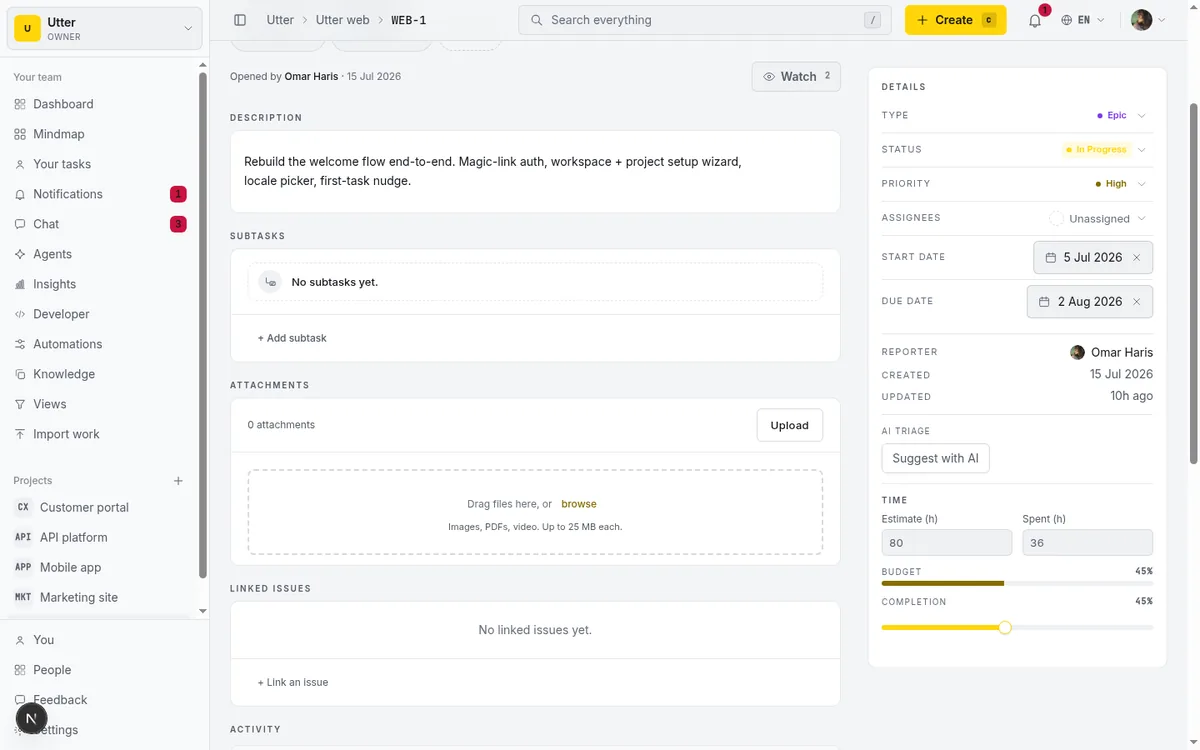
The Time card appears only when the project has any estimate or spent minutes recorded. If nobody on WEB tracks time, you will never see it, and that is fine. When it does show, it gives you Estimated, Spent, and Remaining hour totals with a progress bar across them. One nice touch: Remaining turns pink when Spent has already exceeded Estimated, so a project that has blown its time budget flags itself visually instead of making you do the subtraction.
Below it, the Recent activity feed lists the eight most recent activity events across the project's issues. Each entry has the actor's avatar, a verb describing what they did (created, changed status of, set the priority on, renamed, assigned, unassigned, commented on, or deleted a comment on), a link to the issue, and a relative time. It is the project's pulse: what happened, most recent first. An "All issues →" link at the bottom jumps you to the list view when you want the full picture instead of the last eight beats.
Both limits here are fixed and not adjustable: eight activity events, six recently completed. That is a deliberate constraint. This is a glance surface, not an audit log, and eight recent events is the right amount to read in three seconds. When you need the whole history, that is the list view and the individual issue timelines, not this feed.
Where the summary tab stops: limits and the reports tab
Now the honest boundary, because the fastest way to be frustrated by Summary is to expect it to be something it is not.
Summary is not Reports. Reports is a separate tab, further right in the same strip, and it is a different kind of tool. Reports has a period selector (7d, 30d, 90d), filters, and a fuller chart set (throughput, cumulative flow, burnup, breakdowns) that you can configure and slice. Summary has none of that. No period selector, no filters, no configuration. It is a fixed at-a-glance overview, and that fixedness is the point. You do not tune it, you read it.
flowchart LR
    Q[Your question] --> G{Need a time period or filters?}
    G -- no --> S[Summary tab: fixed live snapshot]
    G -- yes --> R[Reports tab: 7d 30d 90d plus filters]
When your question is "show me throughput over the last 90 days filtered to bugs," that is a Reports question. The full walkthrough lives in the project reports and insights guide.
Summary is also read-only. Every control is a link, to the board, the list, or an issue. You cannot edit an issue, drag a card, or change a status from this page. If you came here to update something, you are one click away, but not on this screen.
A few cards are conditional, and their absence is not a bug. Time only shows with tracked time. Current sprint and Sprint velocity only show when the project uses sprints. Sprint burndown needs a real sprint with a couple of days of data. If WEB never runs sprints, three of these cards simply never appear, and the page is complete without them.
The common mistakes, worth naming once more:
- Do not conflate the weekly Velocity card with the per-sprint Sprint velocity card. They count different windows.
- Do not expect to edit from here. Every control is a link out.
- Do not expect story points in the weekly Velocity card. It counts issues, full stop. The sprint burndown and Sprint velocity card do follow the project's estimation unit, so those can read in points.
- A "missing" issue is almost always an archived one. Archived and deleted issues are excluded everywhere on this page.
For deeper timeline analysis and dependency views, the Gantt chart guide picks up where Summary leaves off.
Open your own project's Summary tab now and read it top to bottom once, slowly. The next time someone asks "how's it going," you will answer in five seconds and mean it.
Frequently asked questions
How do I read the project dashboard overview at a glance?
Open the project's Summary tab (it is the project's default landing page). Start with the Open / Done / Done % trio top-right for the headline, then the status donut for distribution, then the Workload and At risk cards for who is loaded and what is due. The whole page is read-only and computed live in SQL, so every number reflects the project's state right now.
What is the difference between the Summary tab and the Reports tab?
Summary is a fixed, read-only at-a-glance overview with no period selector, filters, or configuration. Reports is a separate tab with a 7d/30d/90d period selector, filters, and a fuller chart set (throughput, cumulative flow, burnup, breakdowns) you can slice. Use Summary to glance, Reports to investigate.
How is 'Open' calculated in the header trio?
Open equals total issues minus done minus cancelled. It does not separately subtract the 'failed' status, so any failed work is folded into the Open count. Done % is done divided by total, rounded.
Why is the Sprint burndown or Time card missing from my Summary?
Those cards are conditional. Sprint burndown, Current sprint, and Sprint velocity only appear when the project uses sprints (an active or completed one). The Time card only appears when some issue has an estimate or logged time. A not-yet-started, planned-only sprint is skipped, and with fewer than two days of data the burndown shows a low-data note instead of a line.
Is the Velocity card measured in story points?
No. The weekly Velocity card is a raw count of issues that reached done per calendar week over the last six weeks, aligned to Monday. It is not story points and not per-sprint. The separate Sprint velocity card and the burndown do follow the project's estimation unit, so they read in issues or story points depending on the project, over a different window.
Does the Summary tab count archived or deleted issues?
No. Every card counts only live issues; soft-deleted and archived work is excluded everywhere on the page. If a number looks lower than expected, the usual cause is that someone archived a batch of issues, not a bug.
Why does the At risk card show 100 rows when there are more overdue issues?
The at-risk list caps at 100 rows, sorted soonest-deadline first, but the overdue and due-soon header tallies are counted separately in SQL. So the header numbers stay accurate even when the list itself is truncated. 'Due soon' means due within three days.
Can I edit issues directly from the Summary tab?
No. Summary is read-only. Every control on it is a link that takes you to the board, the list view, or an individual issue to make the change there. That constraint keeps the dashboard trustworthy as a pure at-a-glance read.
Related reading
Project reports and insights
Read Utter's project reports and dashboards: Summary KPIs, sprint burndown, cycle time, throughput, workload, and workspace Insights, with the honest limits on each.
July 15, 2026 · 16 min read
How to use a kanban board: a complete guide with a real example
Learn how to use a kanban board in Utter: read cards, drag tasks between columns, add and reorder custom columns, set WIP limits, filter, and save views.
July 15, 2026 · 20 min read
Project calendar view
Open Utter's Calendar tab to see project due dates on a month or week grid, drag deadlines to reschedule, edit status inline, and filter by assignee.
July 15, 2026 · 13 min read
Stop chasing status updates: let AI write the weekly project digest
How to automate a weekly status report with AI that reads what actually moved and what stalled, instead of a dumb scheduled dump of ticket counts.
June 1, 2026 · 7 min read
How to use the mindmap
How to use Utter's project mind map view: open the radial tree, read the pills, expand and filter branches, group by Hierarchy/Status/People, and export a PNG.
July 15, 2026 · 14 min read
See your whole project as a mind map (and when it beats a nested list)
A nested list hides how work relates. A mind map shows it. When a map of your epics and stories helps, when a list is better, and how Utter's does it.
July 5, 2026 · 7 min read
How to track time on issues
How to track time on issues in Utter: set estimates and spent hours, read the budget bar, set completion, and roll it all up on the project summary.
July 15, 2026 · 14 min read
Can an AI run your standup?
Mostly yes, and your team will thank you. What an agent can compile from the board, what still needs a human, and how to set up an async AI standup.
July 15, 2026 · 6 min read
Notifications and watching issues
Set up Utter notifications and watch issues: the four events that notify you, who gets pinged, inbox triage, snooze and archive, and email vs in-app.
July 15, 2026 · 16 min read

How to filter and sort issues
Filter issues by assignee, label, and status in Utter's list view, then sort, group, save a view, and share the exact filtered list as a URL.
July 15, 2026 · 16 min read
أضف تعليقًا
ابدأ النقاش.